از اون جایی که خیلی از ما ها کمتر هنر دوران مدرن و معاصر -نه هنر همین ایام و امروز- رو کمتر دیدیم ، با وجود این که این وبلاگ قرار اصلی ش گزیده نشون دادن هنرها و آثار هنری دیدنی اکنون جهانه،
ولی یه تیتر هم با عنوان هنر مدرن از این به بعد گاه به گاهی از هنر و معماری دوران معاصر پیش از امروزِ روز، از این به بعد داریم......
با این حساب دو تیتر "هنر تاریخ" و "هنرمدرن" هر دو به کارهای گذشته میپردازن! گذشته ی دور و گذشته ی نزدیک.....
×××
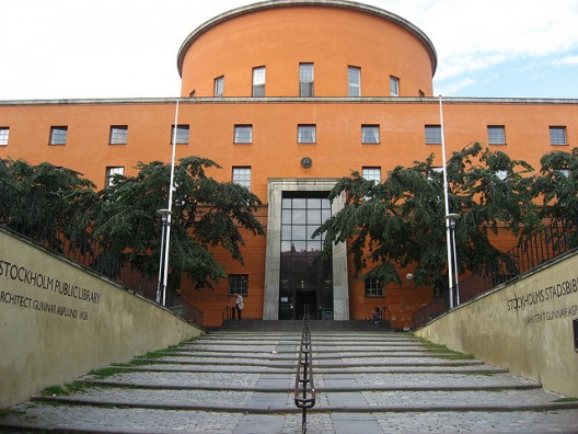
کتابخانه ی عمومی استکهلم ؛ 1918-1928

©Sam Teigen
In the early 1900s, the concept of a public library was being adopted by the City of
Stockholm in
Sweden. Gunnar Asplund was initially hired to help determine the requirements for a public library and then prepare a competition open to all architects. Beginning his research in the United States, Asplund saw first hand examples of the most developed library system in the world. He became very informed and when the building committee realized the strength that he had in his understandings and ideas, they decided he would be the most suitable architect for the job.
More on the
Stockholm Public Library after the break.

©Flickr: username- P-E Fronning
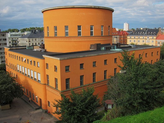
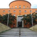
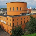
The site of the library rests beside a steep hill, which influenced the designs of Asplund from the beginning as he did not want the library to be overpowered by it's environment; thus he decided on a compact, orange-colored mass. He was sure that the form would be heavy and massive throughout the design process, but had much deliberation over multiple different organizational schemes.
Upon the start of the project, Asplund placed the library on the corner of the L-shaped parcel of land. The other two parts of the land would be used for other community spaces; one would become a park, the other a market hall. While the library was being constructed, Asplund entered and won a competition to design the park adjacent to the library. He envisioned a large rectilinear pond surrounded with flowing streams and waterfalls, although the final design was modified to be more probable. The building committee also asked him to design the market hall, although this portion of the project was never built.

©Sam Teigen
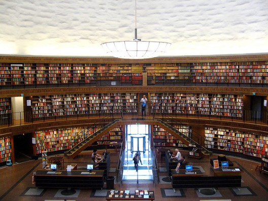
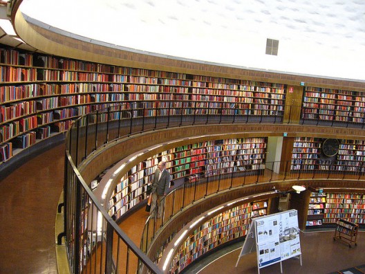
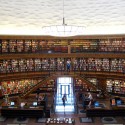
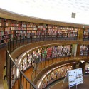
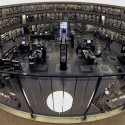
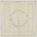
The classic style of the architecture is revealed in the neoclassical composition of the parti. Interior reading rooms form a square with an open courtyard in the center of the library, which is almost entirely filled by a round lending hall. Beginning as a dome, the lending hall eventually became a tall cylinder for structural, economical and formal reasons. The only points of accessibility to the central area of the library are found at the four tangent points.

©Sam Teigen
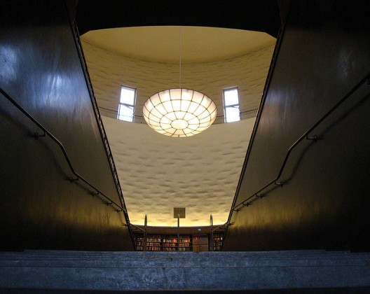
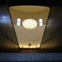
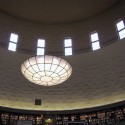
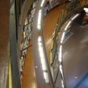
The processional entrance to the library that is found at the end of a dramatic staircase is marked by high walls of polished black stucco. Walls along the circular courtyard on all levels are lined with books and beautifully detailed wooden bookcases. As the eye continues up the interior, a contrasting rough stucco wall jets upwards towards the top of the cylinder, where the room is filled with light through the high clerestory windows. The hanging chandelier made of white opalescent glass is upwardly concaved, allowing it to capture light from the windows and take on an intense glow as it becomes a focal point in the vast open space.

©Sam Teigen
The children's library is located on the ground floor in one of the side wings, adjacent to a specifically designed room intended to be used for story telling. Here, Asplund commissioned painter Nils Dardel to paint a mural of discovery, adventure, and fantasy in the reading niche. Architects and authors have studied the library over the past few decades, some finding the library to be a symbol of the human mind. Whether or not it was designed with the human brain in mind, the beauty captured in incorporating the bookshelves as a design strategy is remarkable, especially under the tall white cylinder and abundance of natural phenomenal light.
