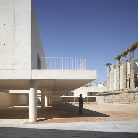
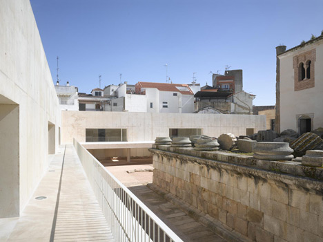
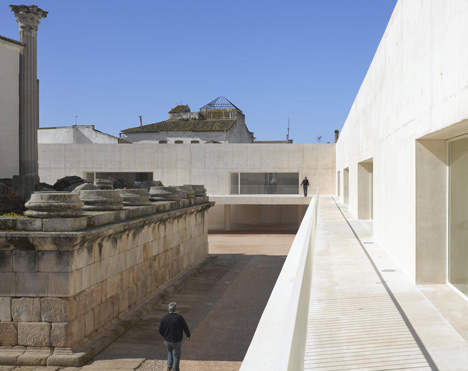
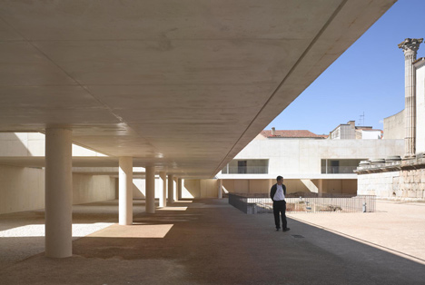
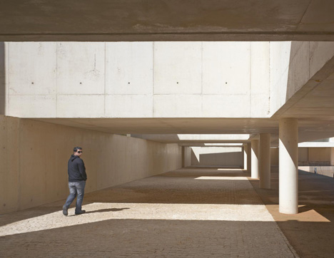
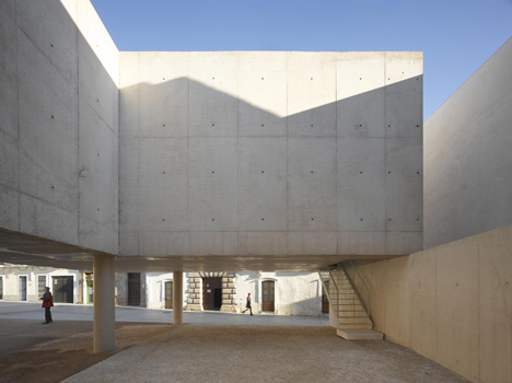
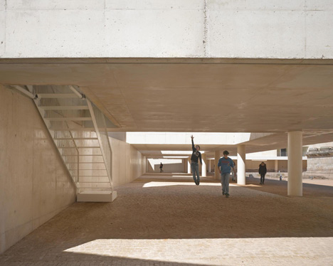
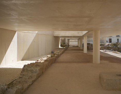
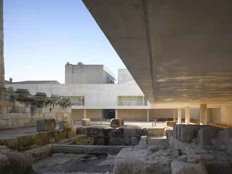
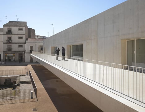
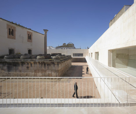
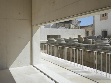
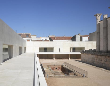
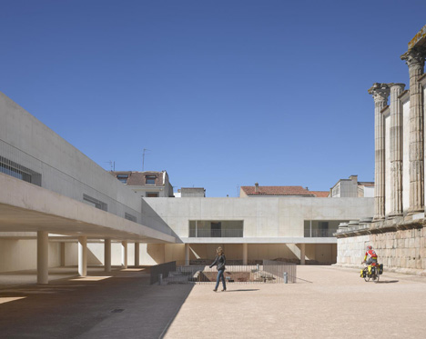
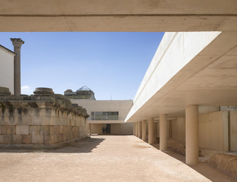
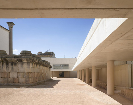
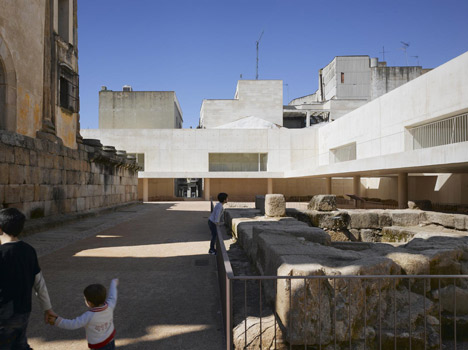
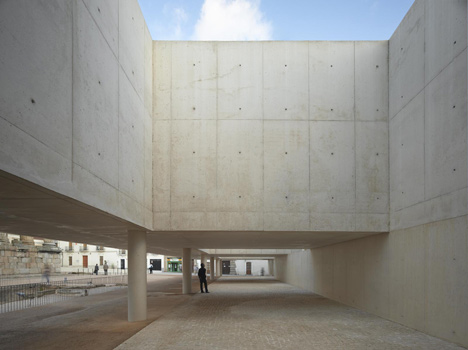
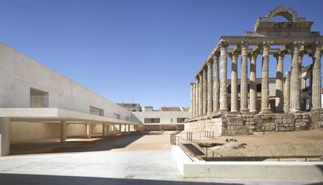
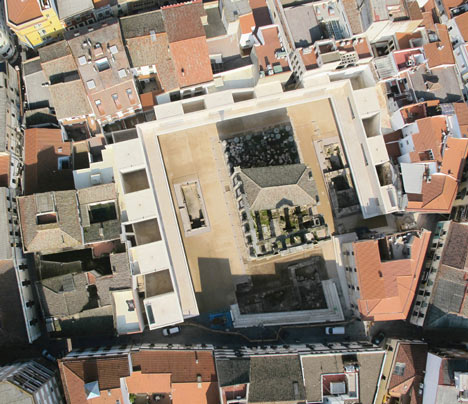
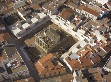
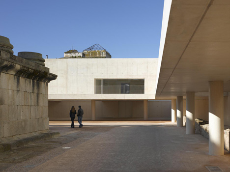
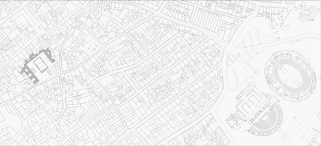
طراحی این بنا به نظرم در نسبت با یه بنای قدیمی باستانی خیلی خوب اومد! از خضوع ارتفاعی اون تا استفاده از مصالح روشن و در تضاد رنگی نه چندان با زمینه و سادگی نماها و پیلوت بزرگ زیر بنا و ایوان طبقه ی اول که هم موجب فاصله گرفتن توده از بنای باستانی شده و هم نمایی مناسب به سمت معبد یونانی رو در سرتاسر بنا ایجاد کرده.... همه و همه راه کارهایی به اندازه و مناسب به نظر می رسن....
این بنا به نظر درسی مناسب برای دوستانیه که در چنین سایت هایی در ارتباط با ابنیه ی سنتی طراحی می کنن.
Spanish architect
José María Sánchez García has created a public square with a raised viewing platform, surrounding a Roman temple in Mérida, Spain.
The two-storey concrete platform is roughly the same height as the adjacent Temple of Diana and has an exterior balcony that allows visitors to walk around three quarters of it’s perimeter.
The square has an earth surface, as it would have done when it was used as a Roman forum.
The following details are from the architects:
Roman Temple of Diana Surroundings and Perimetral Building
The project retrieves the environment of the Temple of Diana in Merida, which was the forum or the city center in Roman times.
The challenge of acting in a place with such historical and archaeological relevance has meant to work with the existing trace since the beginning, so that the finished work would recover this space from Roman times through modern language.
This situation has led to conceive the architectural design not as something closed or completely defined before starting to run.
On the contrary, we worked in a more flexible way, defining the rules and guidelines on how to act in this place, that is to say, the syntax of the project itself, in order to absorb all the irregularities and changes due to the archaeological findings, without losing the initial concept of the proposal.
All this has been developed during five years that, with the archaeological works, the project definition and execution of the construction overlapping in time.
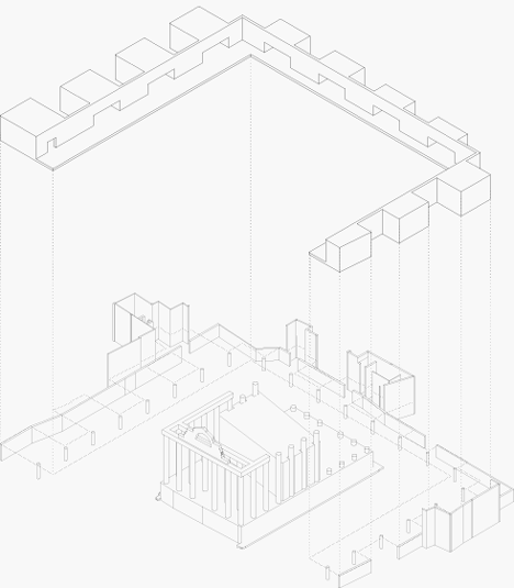
The project is solved with a perimeter piece L-shaped, with its own syntax, sewing its edge with the city and creating a large square around the temple.
This “L” is the union of the platform or high walk (which at the same level of the podium liberates the archaeological level at ground floor, allowing visitors to have a new relationship with the temple) and the structural wall (which puts in Temple value by framing and abstracting it from adjacent buildings).
Between the perimeter L piece and the city, a volume in the form of hanging boxes occupy interstitial spaces accommodating commercial and cultural uses.
Thus, the project, rather than a building is a raised platform, a floating structure capable of generating a new layer of city full of program.
To recover the Roman trace on ground floor, the perimeter structure is placed on the edge of the site, away from the temple, thus giving the largest possible surface to the public square.
The original sacred area is recovered, respecting the Roman archaeological features that are part of the sacred space: the temple, two side ponds, the crypto-portico and the Roman wall, which are now incorporated into the plaza.
The platform stands at about the same height of the podium of the temple to allow visitors to watch it as they were inside, while projecting a shadow over the square.
This way the temple environment gets geometrised, making the understanding of the space clear and not interrupted by the particularities of the back part of the existing buildings.
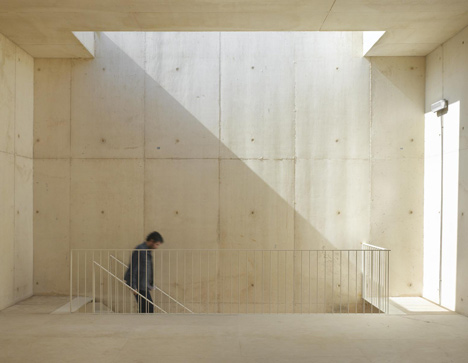
At the rear part, a volume system, flexible to changes in the perimeter, will occupy the interstitial spaces, shaping light patios that rhythmically fragment the platform’s shadow. It defines a new order of light and shade in the square by the patios between the boxes.
The materialisation of the elements that build the new spaces has been studied by a contemporary interpretation of the materials that were part of the Roman space. The whole square will have an earth finishing, as it was originally.
The piece in L is defined as an artificial stone, made of lime and aggregates characteristic of the place with the granite-like color of the podium of the Temple. We don’t talk about concrete as such, but a warmer artificial stone made using materials found in the surroundings.
Credits and Data
Project title: Perimetral building and Temple of Diana environments. Mérida, Spain
Location: Romero Leal and Santa Catalina street, Mérida, Spain
Construction: November 2009 – February 2011
Total floor area: 2158,19m2
Budget: 5.000.847,90 €
Architect: José María Sánchez García
Team: Enrique García-Margallo Solo de Zaldivar, Rafael Fernández Caparros, Maribel Torres Gómez, Laura Rojo Valdivielso, Francisco Sánchez García, José García-Margallo, Marta Cabezón López, Mafalda Ambrósio, Carmen Leticia Huerta, Marilo Sánchez García, Julia Ternström
Structural engineer: CDE Ingenieros, Gogaite S.L
Services engineer: ARO consultores
Technical architect: Ángel García Blázquez, Fernando Benito Fernández Cabello
Client: Consorcio Ciudad Monumental Histórico-Artístico y Arqueológica de Mérida, Consejería de Cultura – Junta de Extremadura
Building firm: UTE Templo de Diana (Procondal – Copcisa)
Click above for larger image
