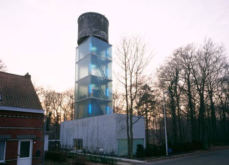
With a skeletal water tower like this one on the outskirts of Antwerp, Belgium, occupation is out of the question. That is, at least until some clever architects come along and add some meat to the bony framework.
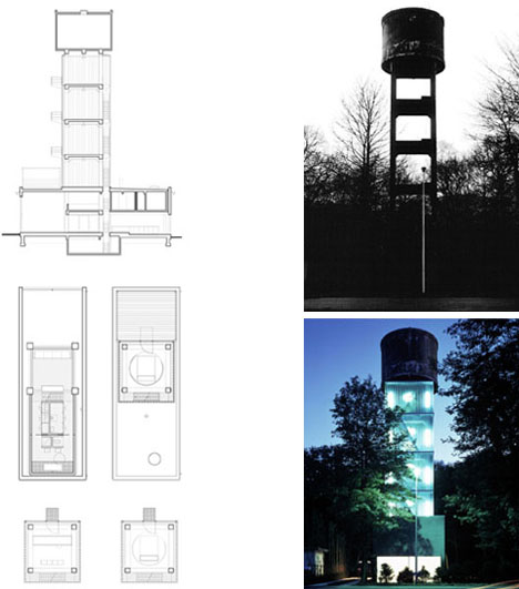
Once the clients set their sites on this spindly structure there was no turning back. A solid first floor surrounds the four-legged base. Above, a series of translucent squares become cladding for four sides on each level, terminating below the vintage barrel at the very top.
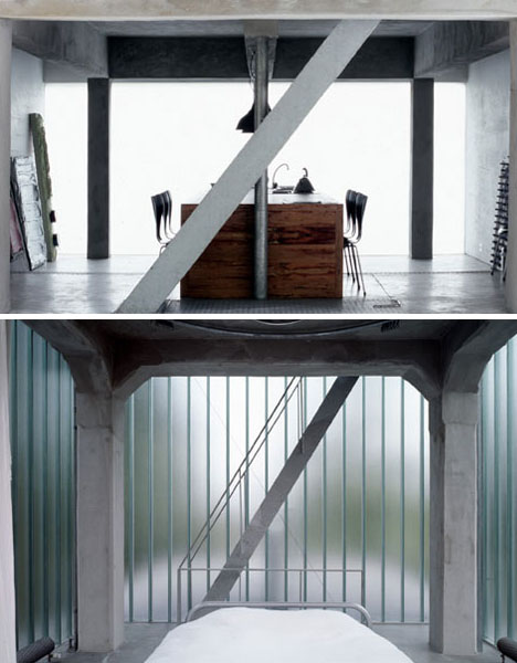
The sturdy concrete columns and beams provide a framework for minimalist modern infill on all floors – a retro industrial backdrop for contemporary wood furniture, white walls and filtered blue light for the upper rooms.
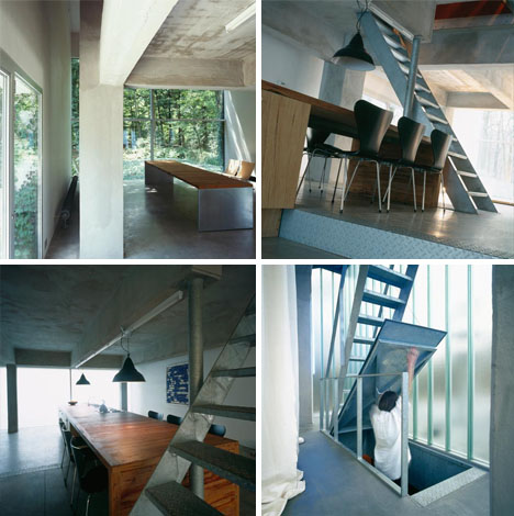
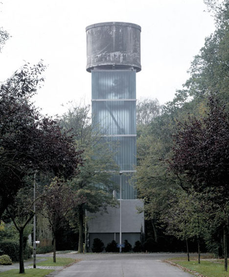
Simplicity in plan and section coupled with translucency in elevation render the original tower relatively legible without compromising privacy, gained on the ground via opacity and above via height. Design by Jo Crepain.
- ۹۰/۰۴/۳۰


