یانون دیزاین ... yanondesign

نگاهی روزانه به طراحی و هنر
نشریه‌ی ‌الکترونیکی روزانه؛ جسـتاری در هـنر و طـراحی
مشترک روزنامه یانون‌دیزاین شوید
پس از تکمیل فرآیند ثبت نام، ایمیل دریافتی را تایید نمایید.
تبلیغات

دوباره یانون‌دیزاین

قریب به نه ماه از آخرین پست انتشاری یانون‌دیزاین می‌گذرد! و دقیق‌تر قریب به یک سال از کم فعالیت‌ شدن و خسته‌ شدن یانون‌دیزاین!

یانون‌دیزاین تا پیش از این یک سال، با جامعه بزرگ و علاقه‌مندی از حوزه طراحی ، معماری و هنر آمیخته شده بود. خیلی‌ها در سال‌های ۸۶ که فقط به فرستادن ایمیل‌های گاه‌به‌گاه دیزاین به صندوق ایمیلی معدودی از دوستان ورودی ۸۵ دانش‌گاه هنرم مشغول بودم تا همین آغاز سال ۹۶ ، کم کم روزانه با ایمیل روزنامه یانون‌دیزاین، سیر اینترنتی خودشان در جهان هنر و طراحی را شروع می‌کردند. خیلی‌ها ابراز لطف فراوانی را در این سال‌ها به تیم فعال یانون‌دیزاین ابراز کرده‌اند و همین خیلی‌ها و بسیاری که منتقدانه و تیزبین همیشه ما را مدنظر داشتند، عمده انرژی و انگیزه پیش‌برد حرکت یانون‌دیزاین بودند. 

واقعیت آن است که مسائلی شخصی برای یک‌سالی این حرکت را متوقف کرد... اما عمده انگیزه‌ای که این سال‌ها پشت یانون‌دیزاین بود و اتفاقات خوبی که پیرامون آن در سال‌های گذشته افتاده بود مانع آن می‌شد که به کل یانون‌دیزاین را فراموش کنیم....

ما به امید خدا از امروز یعنی ابتدای اردی‌بهشت ۹۷ دوباره با انگیزه شروع خواهیم کرد. با هم از جهان هنر و طراحی خواهیم دید.... روزانه و پابه‌پای تحولاتی که در پیرامون‌ ماست.

creased paper architecture and folded paper art

چهارشنبه, ۱۸ مرداد ۱۳۹۱، ۰۱:۰۰ ب.ظ
این پست به دلیل افزوده شدن تصاویر و آثار بیشتر باز نشر می شود:
---------------
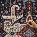
چند سال قبل در یک نمایشگاه، هنرمندی نشسته بود و با وسواس خاصی کاغذی سفید رو درون دست‌هاش می چرخوند. از دور کمی بهش مشکوک شدم! آروم جلو رفتم و ناگهان متعجب و مسحور شدم به طوری که لحظاتی تکون نخوردم و دوستی در کنارم با یه تکون بهم حالی کرد که بسه! باید بریم. نمایشگاه ، خوشنویسی ایران زمین بود در موزه هنرهای معاصر؛ هنرمندی داشت با ناخن روی کاغذی سفید و تنها با ایجاد تا در کاغذ، نستعلیقی جان دار می نوشت..... این اولین تجربه آشنایی با خط ناخنی بود برای من.
شیوه‌ی این کارهای هنری سیمون شوبرت هم دقیقا مشابه تکنیک خط ناخنیه؛ تکنیکی که در اون تنش‌هایی که در بافت کاغذ بواسطه‌ی فشار و تاهای کوچیک ایجاد می شه، اساس خط و سایه و ترسیم رو شکل می ده.
نویسنده مهمان حمیدرضا قدسی:
تمام این طرحها با تا کردن کاغذ درست شده اند
simon-schumbert-folding-3.jpg (605×472)

2. Portrait of Samuel Beckett
simon-schumbert-folding-2.jpg (605×603)
3. Mirrored
simon-schumbert-folding-4.jpg (605×452)4. Mirror Room
simon-schumbert-folding-5.jpg (605×431)
5. Loft
simon-schumbert-folding-1.jpg (605×420)
6. Stairs, Small Room With the Floor
simon-schumbert-folding-6.jpg (605×727)
7. Flight of Stairs and Doors
simon-schumbert-folding-7.jpg (595×800)
8. Stairs
simon-schumbert-folding-9.jpg (589×800)
9. Large Mirror Room
simon-schumbert-folding-10.jpg (605×368)
10. Hallway With Central Mirror

11. Villa Z
simon-schumbert-folding-12.jpg (590×800)
12. Figure In Levels
simon-schumbert-folding-13.jpg (605×683)
13. Stairs
simon-schumbert-folding-14.jpg (605×655)
14. Passage
simon-schumbert-folding-15.jpg (605×665)
15. Long Hallway
simon-schumbert-folding-16.jpg (605×670)

'untitled(stadtschloss-weißer-saal)'by simon schubert, 2011
100cm x 75cm
all images courtesy of the artist
german artist simon schubert has shared with designboom his newest folded paper architectural works. his body of 'drawings' are developed without any addition of color or shading from pen or pencil. schubert meticulously creates each two-dimensional crease designs by folding a single sheet of paper into a flattened scene resembling the interior of both familiar or imagined structures. his newer, smaller pieces include scenes from the series investigating 'stadtschloss', a city palace of berlin. the artist tells us, 'the berlin stadtschloss was build up during the last 350 years for the german emperors and was torn down by the eastern german government during germany was parted. nowadays it is planned to rebuild it. I think it has an interesting history and it is interesting that it doesn`t exist anymore.' the other new folded architecture pieces by schubert have been developed to portray imaginary spaces.

'o.t.-(verspiegeltes-treppenhaus)', 2011
130cm x 140cm
in regards to the artist's thematic and subject approach, schubert tells designboom, 'inspiration most often comes from literature, philosophy, film and fine art.very important are intellectual theories from f.e. gilles deleuze, gottfried wilhelm leibniz, douglas r. hofstadter or samuel beckett. I actually work on similar themes since I started doing art and I often take something up from art history or literature and try to continue the thought or the idea'.

'untitled(sternsaal)', 2011
75cm x 100cm

'o.t.-(freitreppe)', 2012
37,5cm x 25cm
when asked of his creative technique or approach in developing his flattened paper drawings, the artist told us that he sees himself, 'as a sculptor and I work with my paper folding technique to create the folded paper reliefs and different other techniques to build my sculptures. for the sculptures I use all kind of techniques to achieve a realistic, illusionary result.'

'o.t.-(flur)', 2012
37,5cm x 25cm

'untitled(mirrored-hallways)', 2011
150 x 150cm
his first folded paperwork was a portrait of samuel beckett actualized in 2003. the artist tells us, 'I wanted to find a way to make a portrait on different levels, on the one hand the face, on the other hand, I was interested in the reduction of material and technique and the fading into white in reference to samuel becketts work'.

left: 'o.t.-(fenster-geöffnet)', 2012, 35cm x 25cm
right:'o.t.-(türen-geöffnet)', 2012, 35cm x 25cm

نظرات (۱)

  • رسول زاده
  • من با نوک سوزن و اثر دست روی موم نقاشی می کشیدم. اگه اینقدر کیوبیک کار نمی کرد و کم حس لطیف تری داشت خیلی بهتر می شد.

    ارسال نظر

    ارسال نظر آزاد است، اما اگر قبلا در بیان ثبت نام کرده اید می توانید ابتدا وارد شوید.
    شما میتوانید از این تگهای html استفاده کنید:
    <b> یا <strong>، <em> یا <i>، <u>، <strike> یا <s>، <sup>، <sub>، <blockquote>، <code>، <pre>، <hr>، <br>، <p>، <a href="" title="">، <span style="">، <div align="">
    تجدید کد امنیتی