Architects:
Cristian Fernandez Arquitectos,
Lateral Arquitectura & Diseno
Location:
Santiago,
Chile
Project Architects: Cristián Fernández Eyzaguirre, Christian Yutronic V., Sebastián Baraona R.
Collaborators: Marcelo Fernández, Carlos Ulloa, Hernán Vergara H., Loreto Figueroa A., Nicolás Olate Vásquez. Natalia Le-Bert, Nicolás Carbone, Juan Pablo Aguilera, Rodrigo Herrera, Eduardo Cid, Sebastián Bravo, Sebastián Medina, Ximena Conejeros, Irene Escobar, Ricardo Álvarez, Sebastián Bórquez, Rodrigo Carrión
Structural engineering: Luis Soler P & Asociados
Project Area: 44,000 sqm
Project Year: 2009-2010
Photographs:
Nicolás SaiehShoring: Musante, Astorga, Arrau Ltda.
Electrical Engineering: Luis Farías
Lighting: Douglas Leonard Lighting
Services: Enrique Montoya Ingenieria
Climate: Termosistemas (Joel Toledo)/M & R Climatización (Marcela Riveros)
Security: PRY Ingenierìa
Central Control: SIDCO
Garbage Extraction: SRS Ltda.
Scenic Engineering: Enrique Bordolini Consultores Teatrales
Graphic Signs: Di. Diseño & Imagen
Landscape: Andrea Arenas Díaz
Exterior Pavements: Mavimix Ltda.
Audio & Video: Yamaimport Ltda.
Roof engineering: Fernández y Rojas Asociados
Intercom: Antonio Monasterio
Theatrical Consultor: Ramón López
Acoustics: Jorge Sommerhoff
Topography: AEV Topografia
Ground Mechanics: Musante, Astorga, Arrau Ltda.
Urban Impact: Itransporte
Ambient Studies: Itransporte
Energy Efficiency: Juan Cristóbal Pérez
Artist: Juan Guillermo Tejeda
Handicaped Access: Patricia Squella
Isolation: Ingeniería y Construcción ICC
Architecture Review: Holmes & Amaral
Structural Engineering Review: Antonio Medina

axo
We live in time where throwing things out is easier than to repair, adapt and implement value. However, the objects and buildings that surrounded us have a hidden history that is necessary to discover or rediscover if you will. The Diego Portales building (or what’s left of it) is an ideal example. This challenge provided an exceptional opportunity, a gift if you will, transforming what was once a historical burden. The building we believe could not be lost by shortsighted political desires or less for some atavistic return of “blank slate” of an architect of the day.

© Nicolas Saieh
Historical Context
This building, like no other, has been a major player during a period in
Chile’s recent history that was characterized by political and social division. The building was built as a masterpiece a symbol of the “new man” during Salavador Allende’s government. After the coup in 1973 this building housed General Pinochet’s regime embodying the “Total Power.” During the last three decades four governments have occupied the building including the Ministry of Defense. This has led to a building not wanted by most with a “bipolar” biography.

ground floor plan

section
The original building was designed and built in record time. As a strategy, the architects designed a great cover of monumental proportions to subsequently house the building’s program. From the beginning the urban impact was profound, as they installed a huge building with horizontal proportions perched practically on the sidewalk of the main street of the city , and on its other side invading a small residential neighborhood.
A fire on March 5, 2006 in the eastern sector of the building completely destroying the Great Hall. The Chilean government decided to create a future for this building calling for an international architecture competition. Over 55 proposals were received and
Cristian Fernandez Arquitectos teamed with
Lateral Arquitectura & Diseno provided the winning design.

© Nicolas Saieh
Proposed Urban Spaces
Their approach to the building was to immediately address the surrounding environment, providing a new relationship to the previously unacknowledged surroundings. The architects decided to focus on four main concepts: openness to the city and its urban relationships across a large deck with loose volumes under it, the creation of new public space, the opening of the building to the community by incorporating community programs, and the legitimacy of the project through the incorporation of as many social agents in shaping a new benchmark for the city.

© Nicolas Saieh
Openness and Transparency
A building for arts and culture should always be varying degrees of transparency and share and engage your users not only directly but also to the whole community. Therefore, the architects opted for a design that provided openness with in the public spaces and transparency into the interior spaces. The halls for the performing arts of music, dance, and theater, are on display to the public as “boxes or containers.”

© Nicolas Saieh
Program and Organization
Horizontally the building is organized around three volumes that contain and represent the three major program areas. These are the Documentation Center for the Performing Arts and Music, a Training Room of the Performing Arts, and the Great Hall Theater seating 2,000 people. The three buildings are separate at street level providing multiple covered pedestrian spaces. At the lower levels all three buildings directly connect.

© Nicolas Saieh
Materials
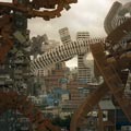
The main materials that make up the building are all possible to find in the original building with five design elements that are worth noting: weathering steel, reinforced concrete in sight, glass, steel, and wood. The use of the weathering steel (with holes) creates an immediate visual link between past, present, and future.

© Nicolas Saieh
Acoustics
Given the specifics of the program each room was treated independently looking for the best acoustic comfort according to its corresponding activity. For example, the Music Hall presents a design of inclined planes and breaks that are capable of directing high quality sound to all viewers and maintaing a warm contemporary expression. The Music Hall along with the Dance Room have space for audio and lighting control located at the bottom of each chamber taking the place of the old translation booths from when it was the Building Diego Portales.


