


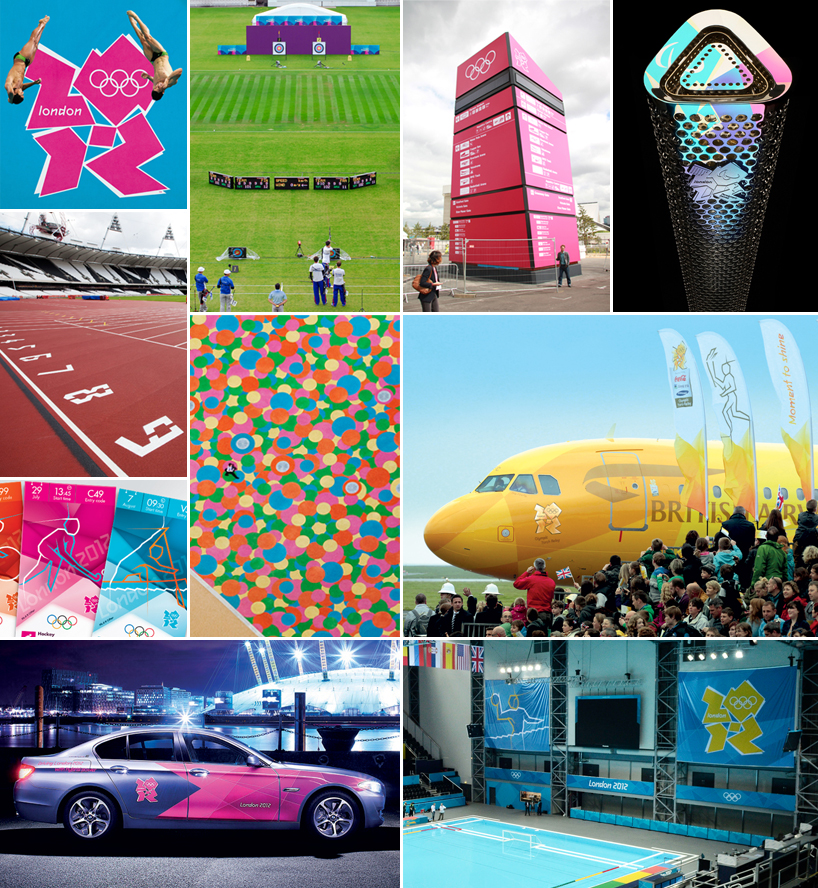
هویت بصری و گرافیک محیطی المپیک ۲۰۱۲ لندن

در این پست مجموعه گرافیک و گرافیک محیطی و فضاسازیهای مربوط به المپیک لندن 2012 رو با هم مشاهده می کنیم. سهم چون منی از جریان المپیک فکر کنم همین چند پستی باشه که این چند وقت از بناهای مربوط به المپیک و یا مثل این پست از هنرهای وابسته به جریان المپیک می ذارم چون به واقع اون قدر بیکار نشدم و وقت رو مجانی به دست نیاوردم که پای تلویزیون جمهوری اسلامی به پای مسابقات المپیک هدر بدم.
خب پست رو مشاهده میکنین و میبینین که تعداد طرح ها به حدیه که نمیتونم در مورد تکتکشون نظر بدم. بگذارین تنها در مورد لوگوی مسابقات و الگوهای اقتباسی از اون که به نوعی خیلی از طرحهای موجود در این مجموعه رو انتظام داده نکتهای بگم.
the overall look of the 2012 games has been overseen by mccann worldgroup in collaboration with london’s organizing committee. over the past 3 years they've collaborated with several designers, architects, advertisers, sponsors and others to implement an impressive visual identity that will be seen across the world for much of the next month.

2012 london olympics logo by wolff olins
image: LOCOG
the logo needs little introduction, love it or hate it, you certainly recognize it. designed by wolff olins in 2007 the logo aimed to attract the attention of a young audience and enthuse them about the games imminent arrival to the british capital. olff olins worked with london’s organizing committee (LOCOG ) to define a clear ambition for london 2012. these games were to be everyone’s. they would call on people to challenge themselves – to try new things, to go further, to discover new abilities. the brand we created supports this ambition.

2012 london olympics logo by wolff olins
image: wolff olins
the emblem is 2012, an instantly recognizable symbol and a universal form one already closely associated with the games in london. it is unconventionally bold, deliberately spirited and unexpectedly dissonant, echoing london’s qualities of a modern, edgy city.
containing neither sporting images nor pictures of london landmarks, the emblem shows that the games are more than london, more than sport. the games are for everyone, regardless of age, culture and language. the emblem is designed to be populated, to contain infills and images, so it is recognizable enough for everyone to feel and be part of london 2012.

2012 london paralympics logo by wolff olins
image: LOCOG
for the first time ever, the olympic and paralympic games will share the same brand, using their own variant of the emblem. and in another first, the cultural olympiad will be able to share the brand. with the addition of the commercial partners, this will be the most cohesive olympic brand in history. new technology is being put in place to get everyone closer to the action and more deeply involved.

variations of the 2012 london olympics logo by wolff olins
image: LOCOG

2012 london olympics typeface by alias
image: alias
'the logo was already designed before alias became involved in the project, wolff olins had used our 'klute' typeface as its starting opine and because of this they thought it would be appropriate for us to design a typeface to accompany it.
the type was briefed and designed to work as a dramatic, powerful and characterful headline type, for use at large sizes, working within and supporting the logo's pre-defined system of angles and shapes. the typeface does this by being linear
and graphic rather than typographic, by capturing a spirit of simplicity, modernity and angular geometry.
- gareth hague, alias

2012 london olympics pictograms by someone
image: LOCOG
38 olympic pictograms designed by someone will be used on merchandise, signs and tickets, environmental graphics and signage - helping spectators find their way to their sport of choice when the olympics begin.
pictograms of each sport were first used at the 1948 games in london and have become a regular feature of the olympic movement since the tokyo games in 1964. otl aicher's pictograms for the 1972 olympics in munich are largely regarded as the design benchmark.
'we wanted to make sure that whatever we came up with was a great piece of design but it also worked hard for our identity… to create an asset that we, our licensees and our partners would use in more creative ways than just at games time - we really wanted to push the concept for the pictograms and one of the outcomes of this was to create two style versions - a silhouette version used for high visibility and information-based applications, and a dynamic version used
both as decoration and where a more exciting version is called for. - do I believe they could rival the munich games' versions? absolutely, because I strongly believe these will touch and inspire everyone – whether in london, the UK or more widely around the world.'
- yasmine say, london 2012 organizing committee (LOCOG)
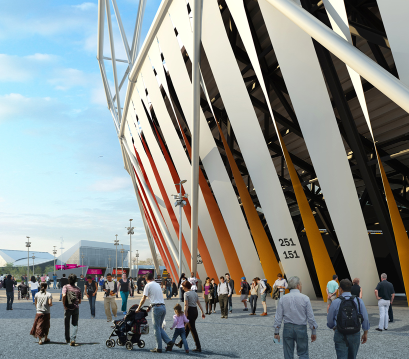
by continuing the outline of the logo 'shard' patterns are formed
image: futurebrand
as part of the mccann worldgroup, futurebrand’s role involved developing 'the look’ of london 2012 and an developing an identity system that works across every touchpoint. from venues, signage, interior dressing, street dressing, ticket design, medal ribbons, the cars that would ferry athletes around; essentially every physical touch-point that spectators, sponsors, officials, the media and athletes would come into contact with during the course of london 2012, both in london and across the UK.
'the core idea was to use the lines and shards that the logo emanates, creating a 'burst of energy'. whether the entire field of play with the seating becoming a huge graphic, or simply surrounding the olympic rings with the burst, printed on a coral on the field of play. it all goes back to the idea of a festival of human endeavour, with athletes pushing beyond their personal best.'
'the grid is used in a flexible and dynamic way, creating shards patterns and textures that radiate from a central focal point. the joy of this graphic device is that it can be adapted across lots of different spaces and places yet remain clearly recognisable and consistent.this means we can tell a single design story, from the seating bowl designs to the patterning
on the concourse.'
'the ensuing look is provocative, unexpected, distinctive and bursting with life. it captures the youthful spirit of london and the energy of the games. this core look has evolved to create separate but related identities for each of main sub brands that are a vital part of the london 2012 experience such as – games makers, get set programme, torch relay
and london 2012 festival. each has to remain true to the core spirit of the games but develop a distinct take on it.'
- matt buckhurst, creative director, futurebrand london

drawing showing how the 'shard' gird pattern is applied to stadium seating
image: futurebrand
this is a good examples of how the grid system can be applied even to the largest applications. this design approach was used at a macro level across stadia and concourses down to a more micro level on individual corals around the field of play where the focal points of the burst are the olympic rings.
as the budgets were never going to be on the scale of beijing we came up with clever ideas, like building the visual look into the seating bowls and flooring (no extra cost for changing the seat colours or aggregate used on concourse areas).

drawing showing how the 'shard' gird pattern is applied to stadium seating
image: futurebrand

olympic stadium seating
image: LOCOG / getty

seating and staidum wrap at the olympic stadium
image: LOCOG / getty

track numbers set in the 2012 typeface designed by alias
image: LOCOG / getty

basket ball arena stadium seating
image: LOCOG / getty

hockey stadium seating
image: LOCOG / getty

ground view of stadium wrap by sophie smallhorn
image: LOCOG / getty
stadium wrap by sophie smallhorn
image: sophie smallhorn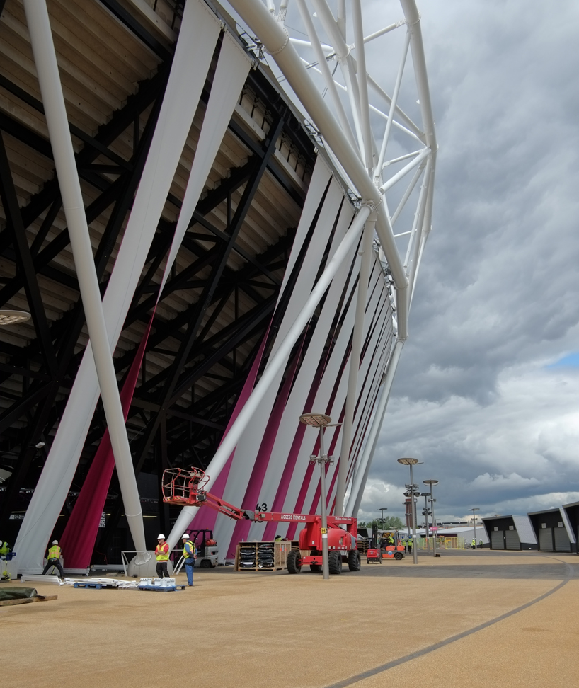
stadium wrap by sophie smallhorn
image: sophie smallhorn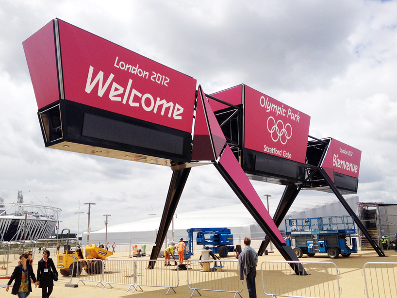
entrance gantry at the olympic stadium
image: surface architects
wayfinding signage by surface architects
surface architects were appointed to work with LOCOG and ISG in the design and delivery of a family of high profile wayfinding structures for the 2012 olympic park. the proposals combine historic vectors and iconic influences into a highly distinctive design that fits LOCOG’s original ‘look and feel’ brief. TFL's johnston typeface is used on the signage in addition to the 2012 typeface.
'each form incorporates LED backlighting, creating a field of glowing beacons across the stratford park. six 7m high zone beacons, five 15m high major beacons and two 12m high entrance gantries are currently being constructed. all are designed from sustainably sourced fabrics and will be dismantled, recycled and reused post games.'
- surface architects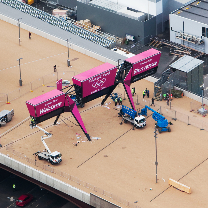
entrance gantry being contsructed at the olympic stadium
image: LOCOG / getty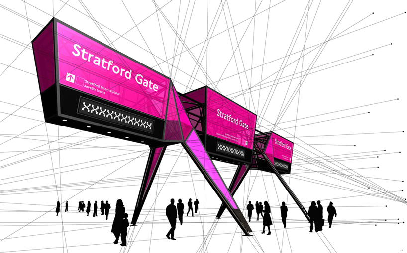
signage diagram
image: surface architects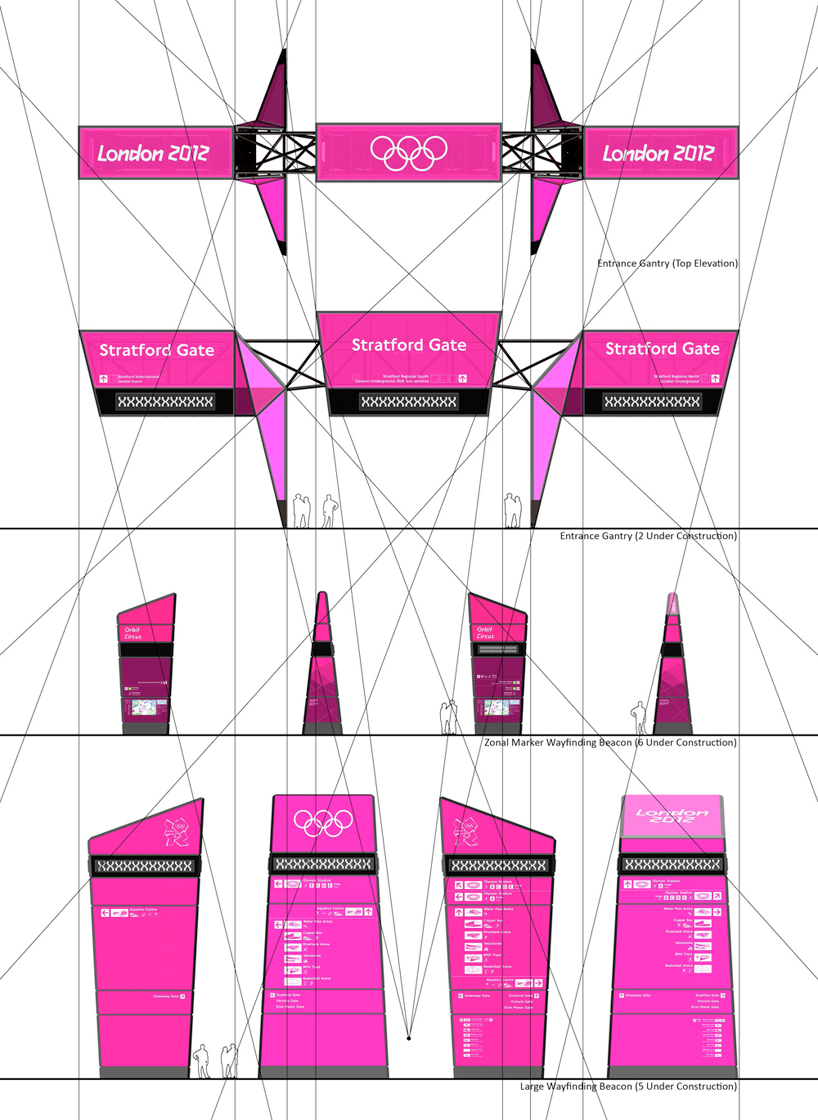
signage diagram
image: surface architects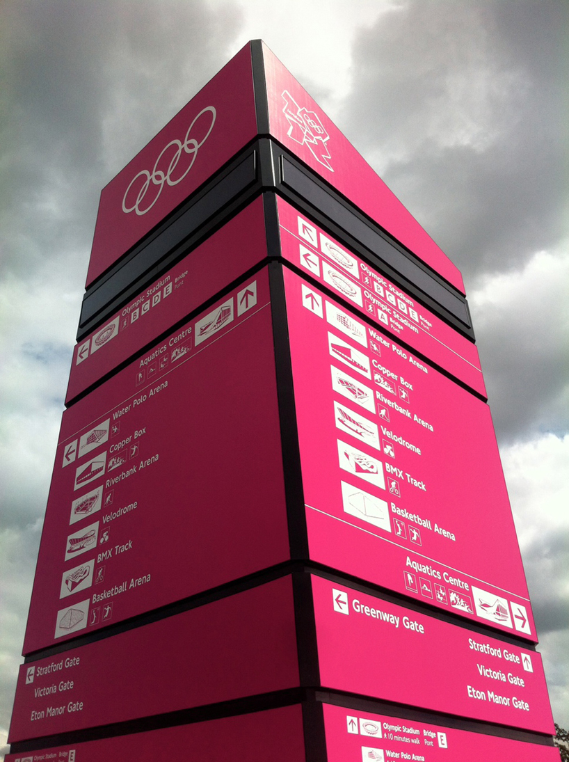
wayfinding beacon by surface architects
image: surface architects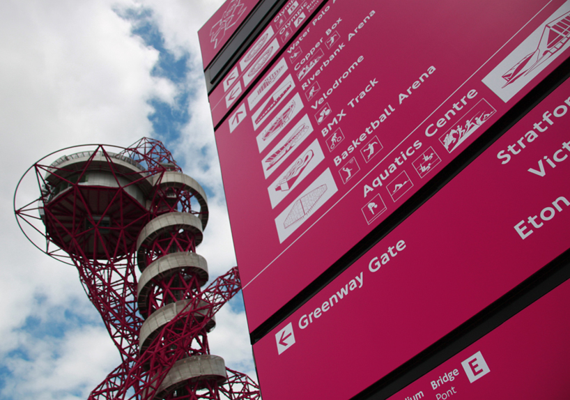
wayfinding beacon by surface architects
image: surface architects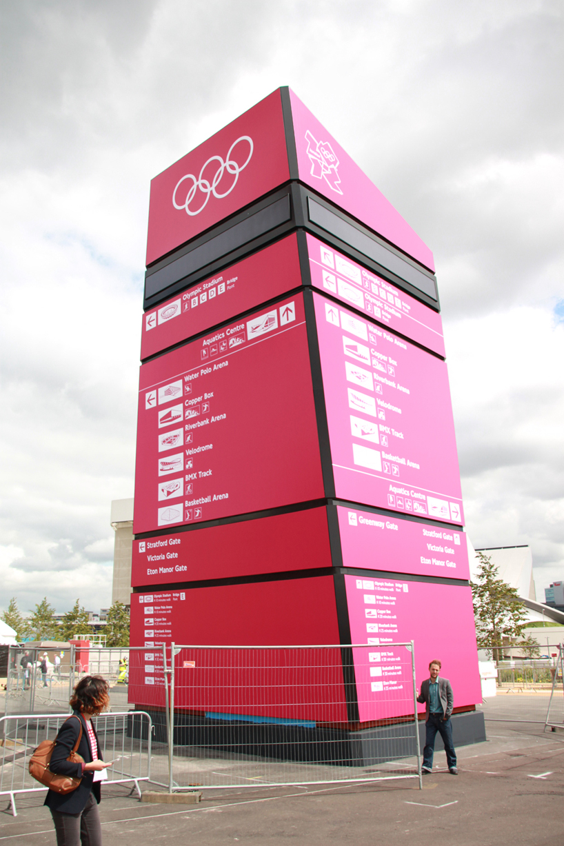
wayfinding beacon by surface architects
image: surface architects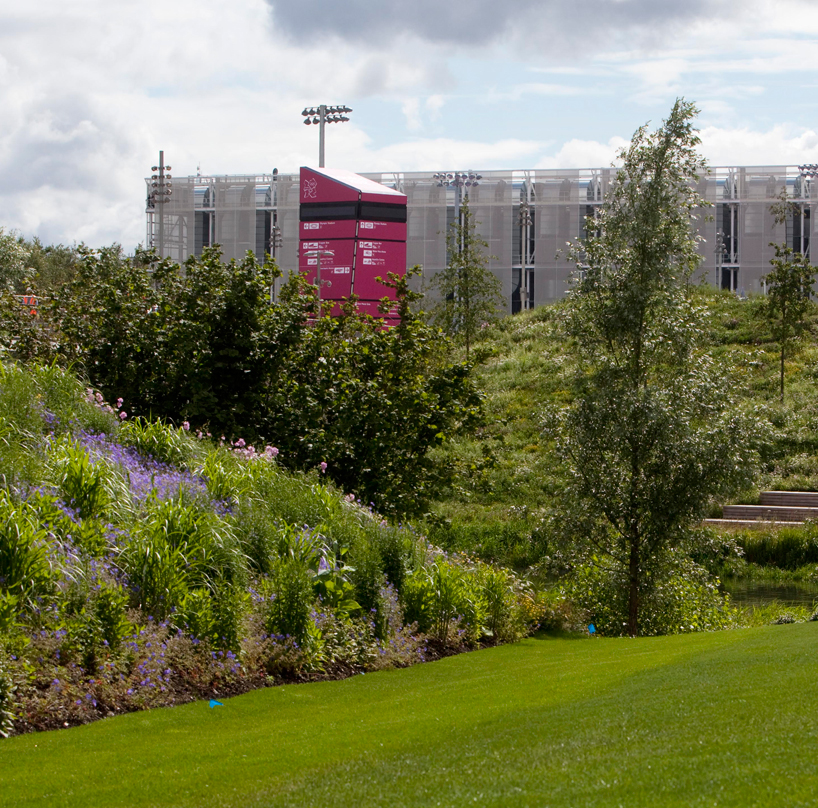
wayfinding beacon by surface architects
image: LOCOG / getty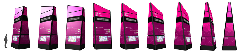
360 view of one of the smaller the signage beacons
image: surface architects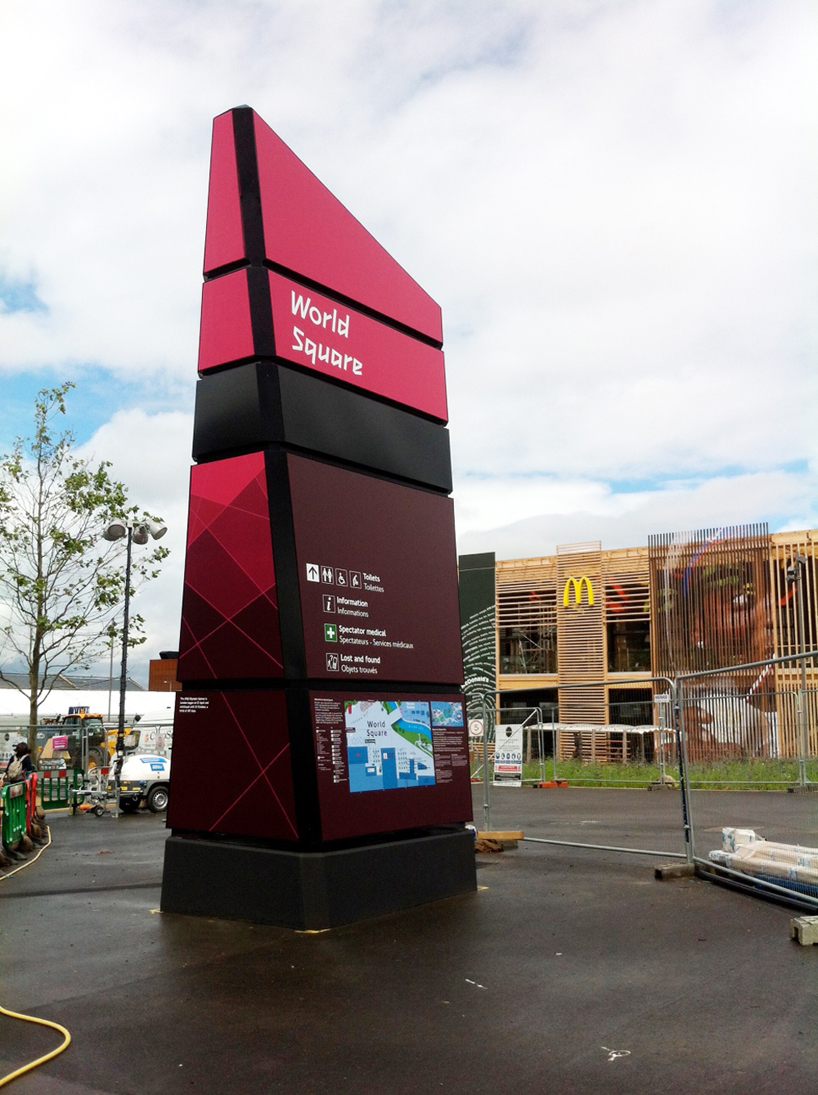
wayfinding beacon by surface architects
image: surface architects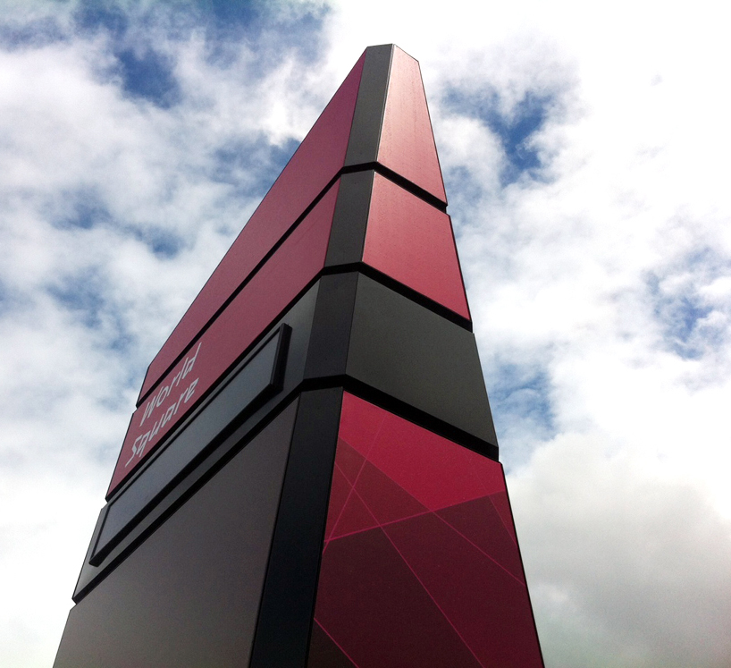
side view
image: surface architects
stratford subway station
image © designboom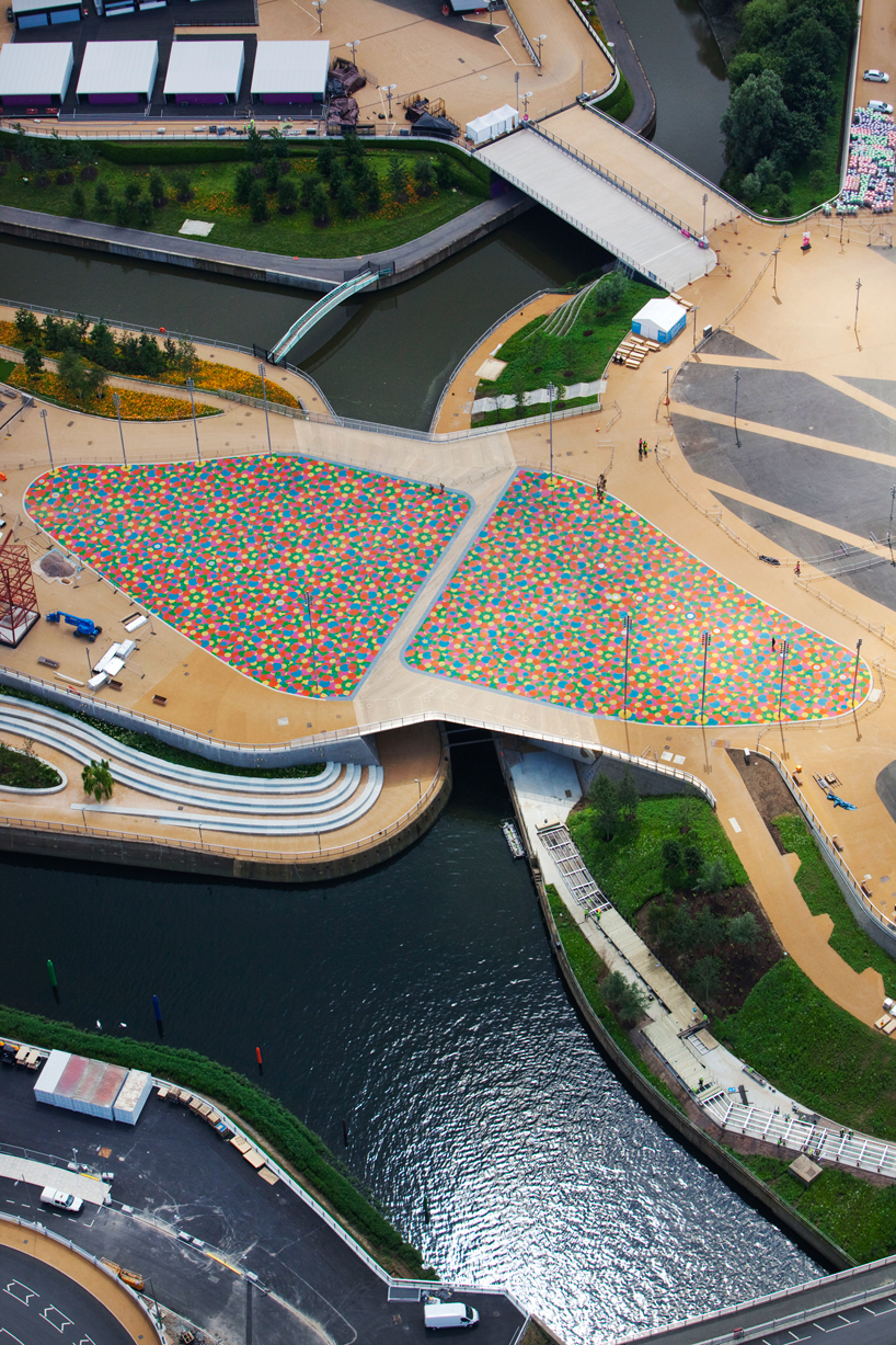
central park bridge by heneghan peng architects
image: LOCOG / getty
while heneghan peng architect's central park bridge falls under the olympics architectural program we have included it here because of its graphic nature, for sure this will be a favorite of broadcasters and photographers.
the central park footbridge spans over the river lea at a focal point between the olympic stadium and aquatics centre, and features both permanent and temporary elements to integrate games and legacy use.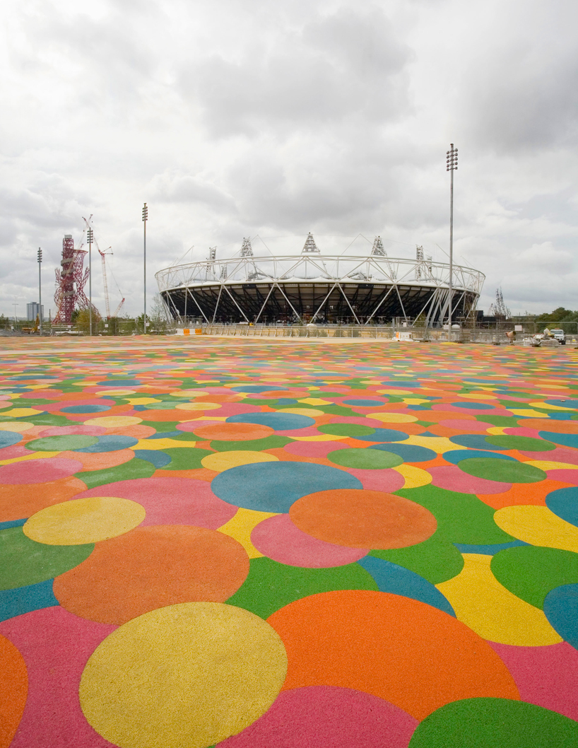
detail of the multicolored rubber deck featured on the central park bridge by heneghan peng architects
image: LOCOG / getty
the bridge features two permanent footbridges linked by a central blade-like walkway, creating a ‘Z’ shape clad in mirror-finish stainless steel that spans the river lea. for games-time, a multi-coloured temporary deck has been placed between the permanent spans of the bridge to increase the width, allowing it to carry increased spectator numbers. the temporary games-time bridge deck has been covered with a multi- coloured rubber surface inspired by the london 2012 brand colours.
after the games, the temporary bridge surface will be removed to create new links from the olympic park concourse level down to the river tow paths and carpenters lock, a 1930’s historic structure on the river lea owned by british waterways.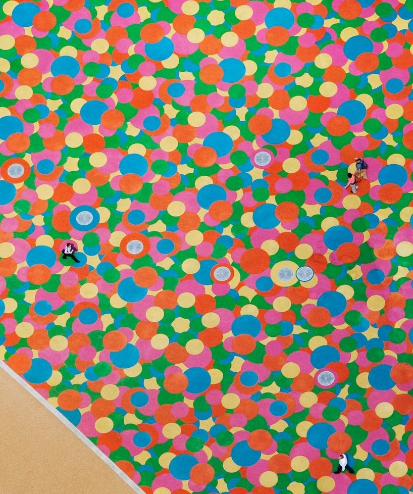
central park bridge by heneghan peng architects
image: LOCOG / getty
the areas around the legacy bridge will be landscaped to create new meeting spaces and the permanent structural elements of the bridge will be further revealed with its mirror-finished stainless steel cladding designed to reflect the sunlight off the water in the river lea. a total of 125 tonnes of steel was used in the construction of the central park bridge which has a games-time width of 58 metres, with the two main permanent sections spanning 30m in length.
the central park bridge, which was last week shortlisted in the prime ministers better public building awards, is part of the wider structures, bridges and highways project – the single biggest construction project the oda has delivered to create new connections across the olympic park. construction work is now 90 per cent complete on more than
30 new bridges and underpasses that cross waterways, roads and rivers to create a connected, open and accessible olympic park for games and legacy.
you can find more about the central park bridge here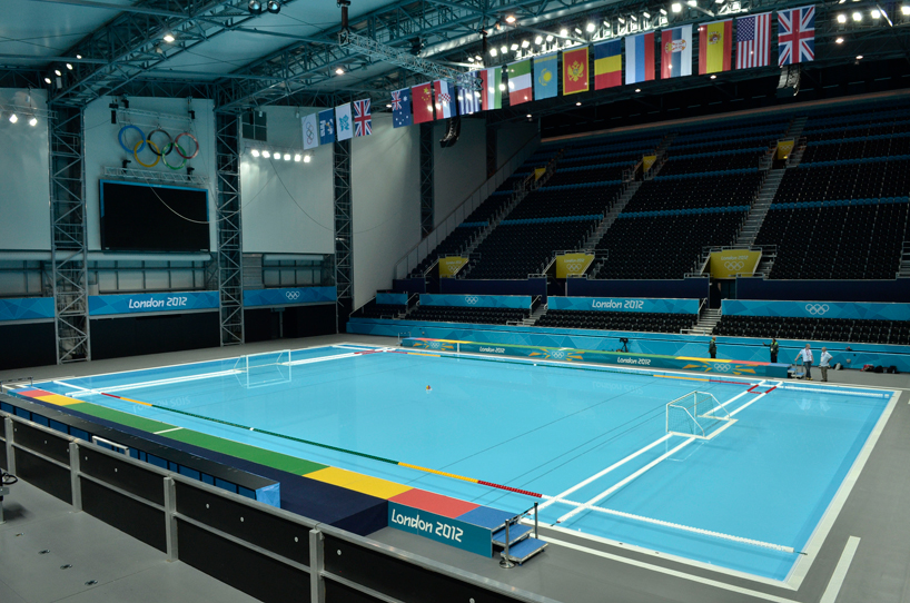
fully dressed water polo venue - banners and environmental graphics by futurebrand
image: LOCOG / getty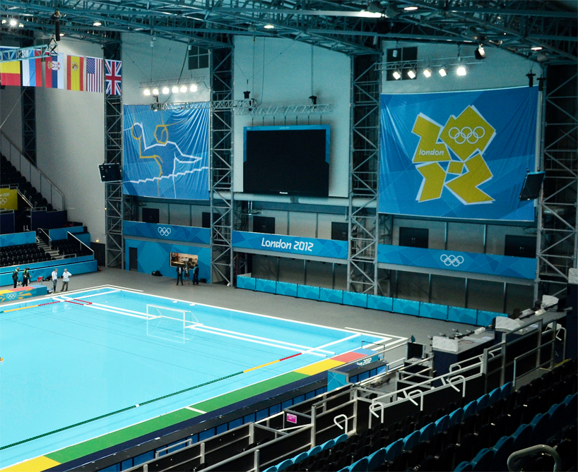
fully dressed water polo venue
image: LOCOG / getty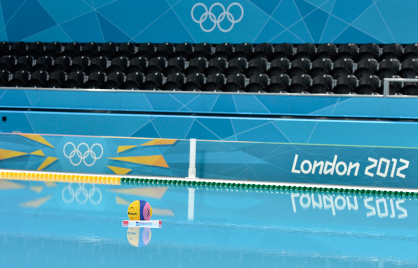
fully dressed water polo venue
image: LOCOG / getty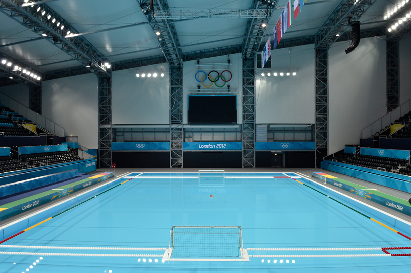
fully dressed water polo venue
image: LOCOG / getty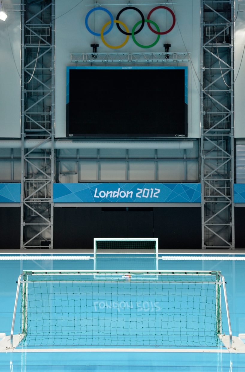
fully dressed water polo venue
image: LOCOG / getty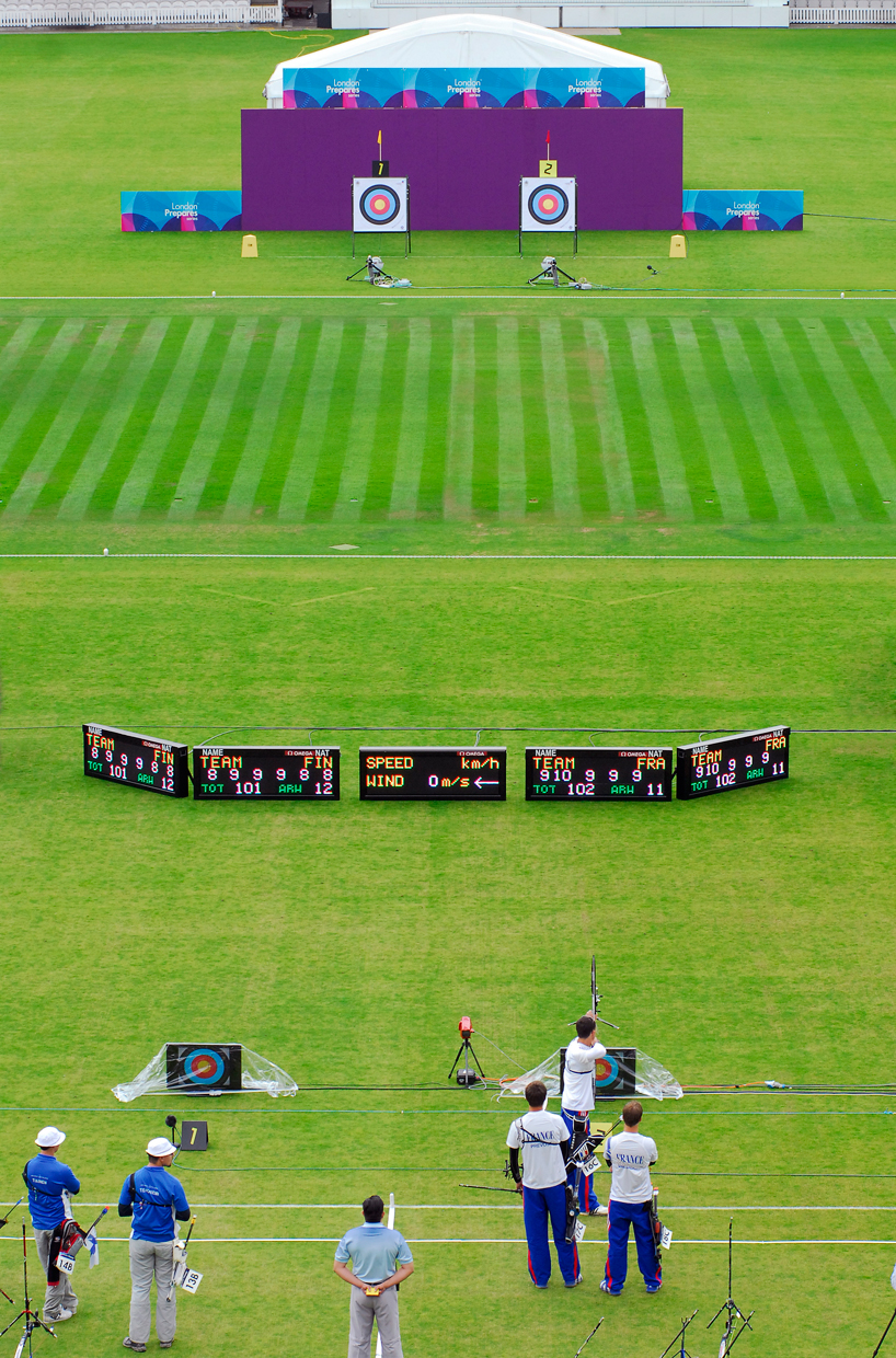
archery which will take place at lords cricket ground will look something like this
image: LOCOG / getty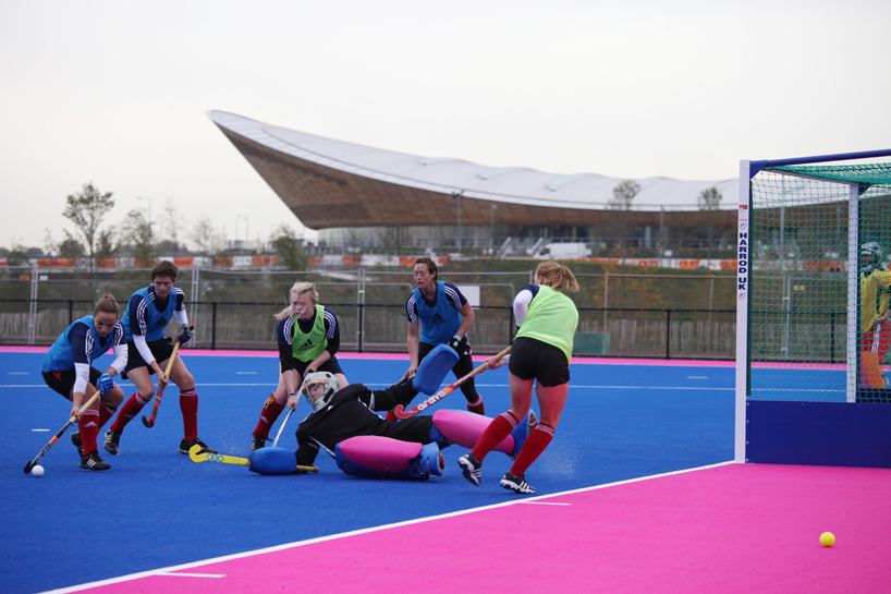
hockey field using the london 2012 brand colors
image: LOCOG / getty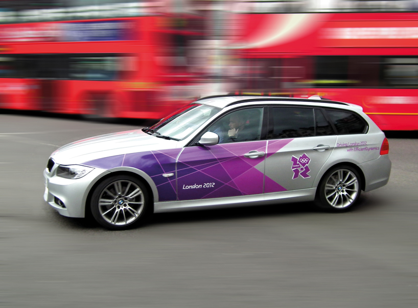
dressed BMW with graphics by futurebrand will make up the majority of the 2012 olympics vehicles fleet
image: futurebrand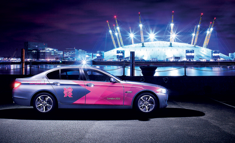
dressed BMW with graphics by futurebrand
image: futurebrand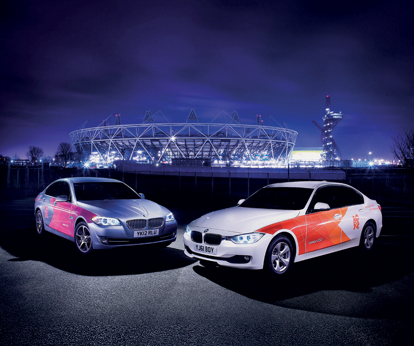
dressed BMWs with graphics by futurebrand
image: futurebrand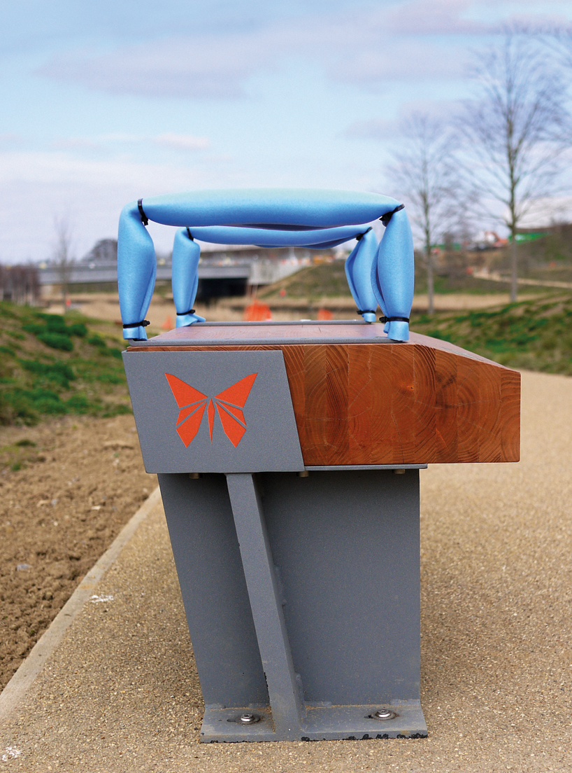
walk in the park identity by futurebrand
image: futurebrand
‘walk in the park’ gives you the chance to see the olympic parklands from a completely different angle, surrounded by meadows, trees, flowers and wildlife – and to discover fascinating facts about its history and redevelopment. whether you have time for a 30-minute stroll or a three-mile walk, it’s the perfect way to explore the olympic park - just follow the butterflies along the trail.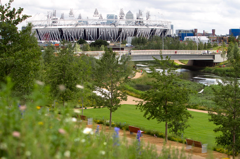
view of the parklands
image: LOCOG / getty
250 acres of new parklands, on former industrial land, that will provide a colourful and festival atmosphere for the london 2012 games and afterwards become the largest new urban park in the UK for over a century.
over 1,500 trees have been planted along with thousands of wetlands plants and the wetland bowl in the north of the park is complete with 15,000 square metres of riverside spectator lawns, timber seating, frog ponds, loggeries, wetlands, woodlands and tree-lined footpaths.![]()
walk in the park identity by futurebrand
image: futurebrand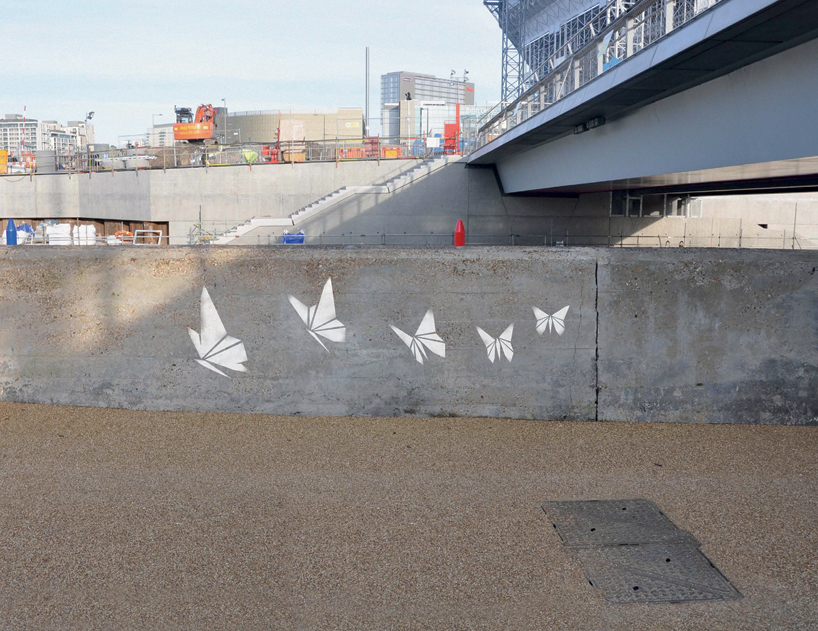
just follow the butterflies along the trail
image: futurebrand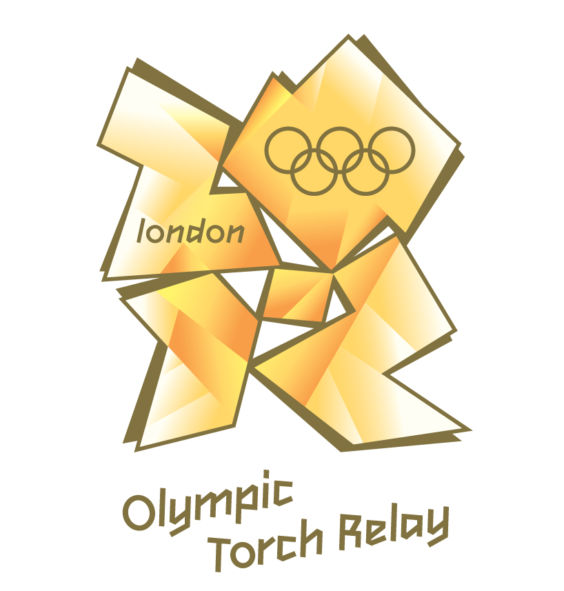
olympic torch relay identity by futurebrand
image: futurebrand
the olympic flame is an iconic symbol. the moment when the torch passes through their neighbourhood is the moment when the olympic games becomes ‘real’ to them. it is a moment when people feel connected to what can seem like a distant entity. we wanted to make the most of this feeling of being ‘part of it’. we invited the public
to nominate people they knew personally, inspiring people, to become a torch bearer. we encouraged the public to ‘give people their moment to shine.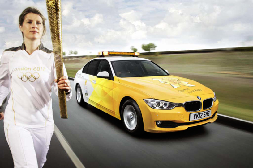
olympic torch relay uniform by adidas and livery by futurebrand
image: futurebrand
the sentiment is reflected in advertising and design. the design used the idea of reflected and refracted light, always harking back to the flame itself. this design motif appears across print, web and even the livery of the british airways plane bringing the flame from athens. at the end of the application process we had found enough inspirational people to
fill the available torch bearer places tenfold. everyone nominated by their own peers, nominated to proudly bear the torch through the streets of their own neighbourhoods.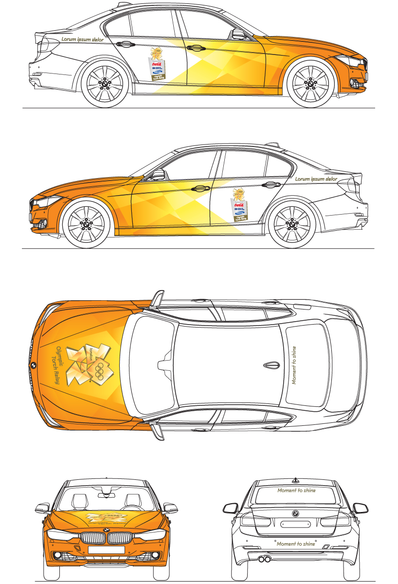
olympic torch relay livery by futurebrand
image: futurebrand

detail of the olympic torch relay livery by futurebrand
image: futurebrand

british airways firefly with graphics by futurebrand
image: futurebrand

british airways firefly with graphics by futurebrand
image: futurebrand

aaron bell holds the olympic flame at the historic estate of temple newsam in leeds at the end of day 37 of the london 2012 olympic torch relay
image: LOCOG / getty
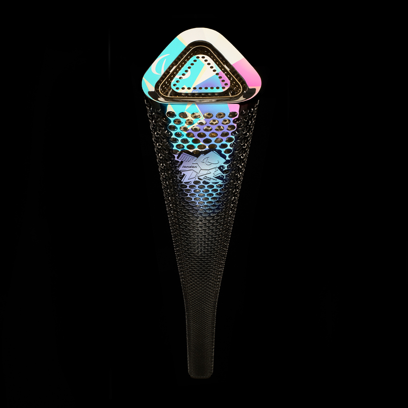
paralympic graphics on the torch designed by barberosgerby
image: LOCOG / getty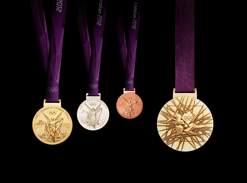
medals by david watkins
image: LOCOG / getty
the medals' circular form is a metaphor for the world. the front of the medal always depicts the same imagery at the summer games – the greek goddess of victory, nike, stepping out of the depiction of the panathinaiko stadium to arrive in the host city. the core emblem is an architectural expression, a metaphor for the modern city, and is deliberately
jewel-like. the river thames in the background is a symbol for london and also suggests a fluttering baroque ribbon, adding a sense of celebration. the square is the final balancing motif of the design, opposing the overall circularity of the design, emphasizing its focus on the centre and reinforcing the sense of 'place' as in a map inset. the ribbons used for the medals were designed by futurebrand.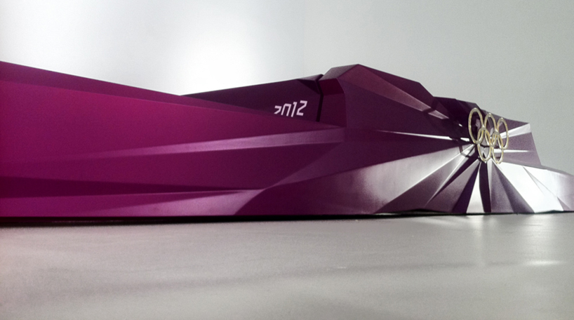
olympic winners podium by kims
image: kims
podium and ceremonial costumes by RCA students
the royal purple podiums and costumes were created by students at the royal college of art (RCA) in london. the students have worked with london 2012 over the last eight months to create and develop the designs.when designing the podiums, the team of students - gaetano ling, hong-yeul eom, luc fusaro, heegun koo

olympic winners podium and ceremonial cotume
image: LOCOG / getty
the ceremonial costumes will be worn by games maker volunteers in athlete and presenter escort roles and flower and medal bearer roles. the elegant and dynamic designs by students thomas crisp and trine hav christensen represent london and its architecture with a modern twist. when designing the costumes the students were inspired by greek mythology as well as british heritage. a hat will also be worn by the presenter escorts. the inspiration for this design by former student zara gorman included the architecture of the london 2012 olympic and paralympic games venues combined with aspects of british tailoring and sportswear.

tickets by futurebrand
image: futurebrand

olympic merchandise store by futurebrand
image: futurebrand
merchandise shop by futurebrand
the merchandise shop had to reflect the core brand values of london 2012. but, it also had to be an efficient and commercially viable retail space, driving flow through the shop and up to the till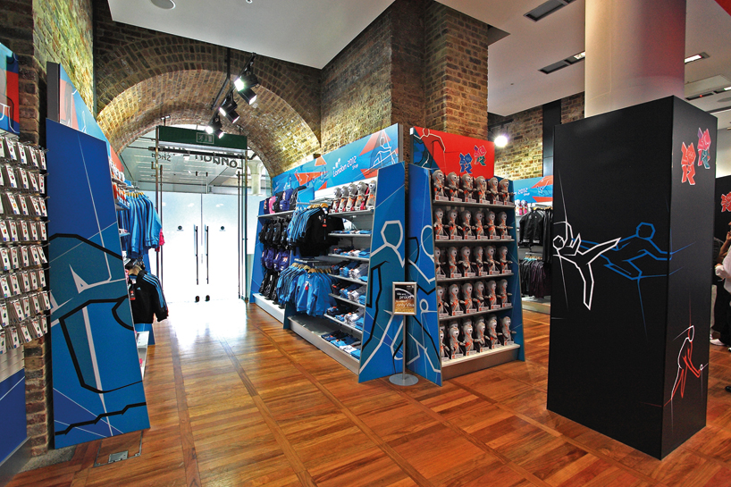
olympic merchandise store by futurebrand
image: futurebrand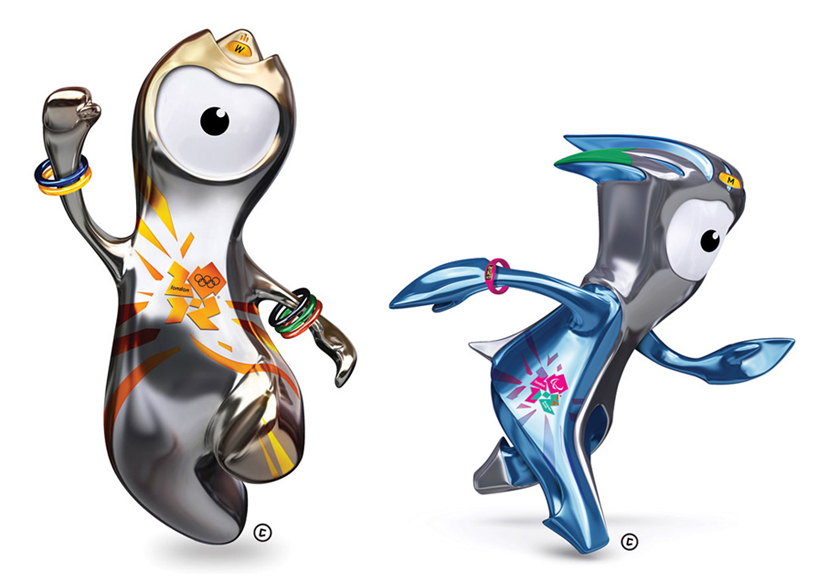
olympic mascots 'wenlock' and 'mandeville' by iris
image: futurebrand
'wenlock' and 'mandeville' designed by iris are just as flexible as the rest of the 2012 identity, with their appearance changing to incorporate different elements of the branding elements. the one-eyed characters were created from the last two drops of british steel used for the london 2012 olympic stadium - more information on the mascots can be found here.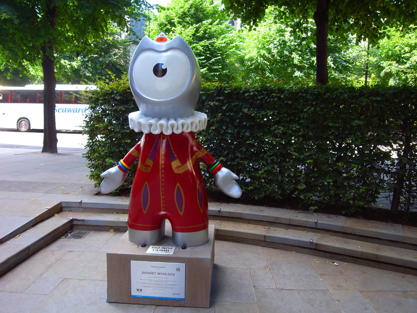
sonnet wenlock, part of stroll: discovery trails
image © designboom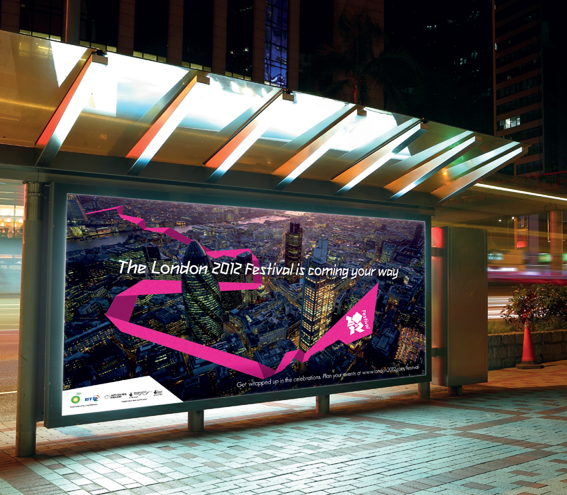
london 2012 festival billboard by futurebrand
image: futurebrand
the cultural olympiad runs alongside the olympic and paralympic games. it is a little known and often misunderstood part of the games experience. the challenge is to drive awareness of it and make it seem inviting and approachable. for many people ‘culture’ can seem heavy and ominous. calling it london 2012 festival was the first step to making it more accessible. the second step was the development of the pink ribbon, a symbol of celebration and inclusiveness.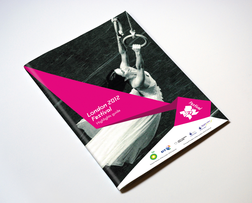
london 2012 festival guide by futurebrand
image: futurebrand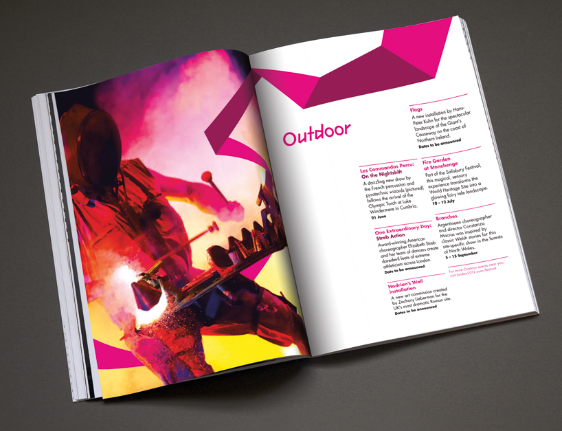
london 2012 festival guide by futurebrand
image: futurebrand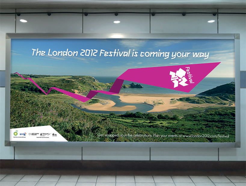
london 2012 festival billboard by futurebrand
image: futurebrand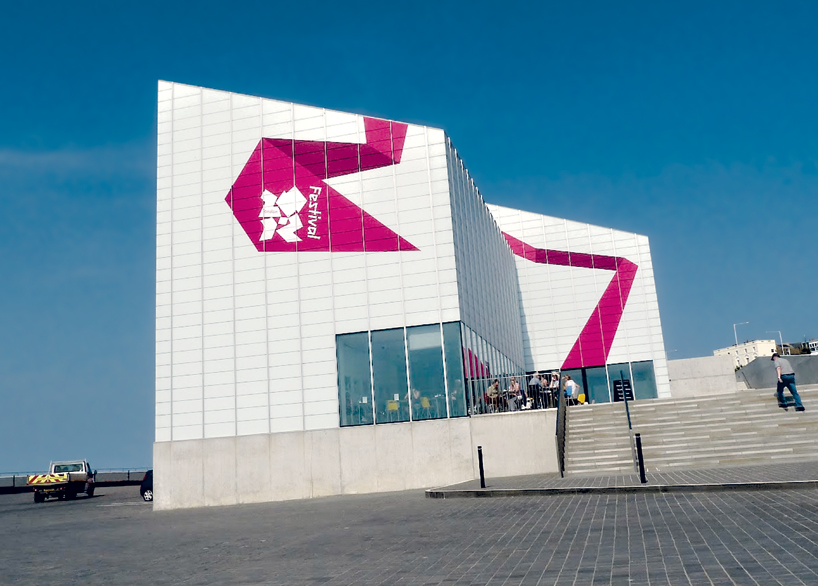
london 2012 festival graphics by futurebrand applied to turner margate galler
image: futurebrand