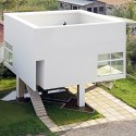
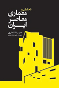
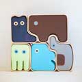
مجموعهای چهل تایی از کارت ویزیت های معمارانی که هرکدوم شاید سعی داشتن تمام ایده و نگاهشون رو در شیرین کاری کارت هاشون خلاصه کنن یه جورایی! برای بچه معمارها و گرافیست ها و خلاصه همه بروبچه های هنر و حتی برای مشاغل دیگه هم این کارت ها می تونه منبع الهام و ایده های نو باشه

Dear architects, if you ever felt like you needed a head start with a client or are simply on the lookout for a creative way to get to get your message across, today's post is for you. After some serious research, we gathered a series of architects' business cards that defy patterns and stand out in any wallet. As you can see in the photos below, most of them feature architecture-related imprints, others even come with an integrated small 3D house. Black, white, gray and blue are the colors preferred by architects when choosing a business card, but who says one has to be this sober? Sometimes bold colors may induce the idea of bold projects and this could eventually attract daring clients and briefs. However, it is very important that a card mirrors the personality of the company/architect. We invite you to have a look at the examples below for inspiration and complete the list if you have any other interesting examples of architects business card.


