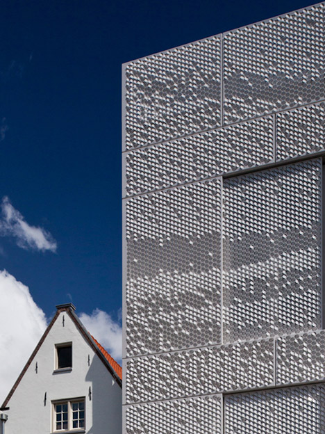
این دیتیل ساختمانی صفحههایی فلزیه که با شبکهای مشابه شبکه لانهای زنبور عسل برش خورده و سطح هر خانه میتونه با زاویهگرفتن به دو سمت محور خودش سایهاندازی متفاوتی داره
این رفتار به طراح اجازه میده تا با برخوردی پیکسلی و با استفاده از ظرفیتهای سایه و نور بر روی جزواحدهای دیتیل هر الگو که بخواد رو بر روی نما ایجاد کنه. نما در عین حال که یک مشبک نورگذر خواهد بود از نقطه نظر زوایای مختلف و در طول ساعات روز یک الگوی تصویری در حال تحول رو بازنمود می کنه
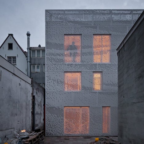
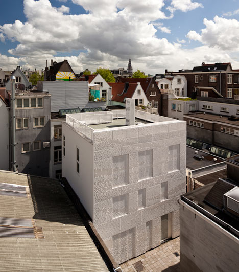
Dutch designer Chris Kabel has wrapped this house and studio in Amsterdam with a facade of perforated hexagons that catches the light like a hanging sheet of fabric.
Kabel was approached by architecture studio Abbink X de Haas to collaborate on a building exterior that would relate to the history of the area, which is within the city’s red light district but is also associated with the textile industry. “This was the area where wool and cloth were dyed in the sixteenth and seventeenth century, in fact one of Rembrandt’s paintings depicts the people that worked here,” the designer told Dezeen.
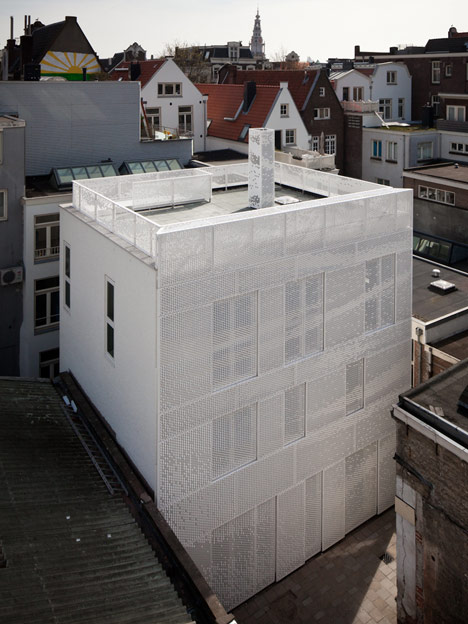
After considering a series of laser-cut screens, Kabel instead decided to use sheets of aluminium with perforated sections.
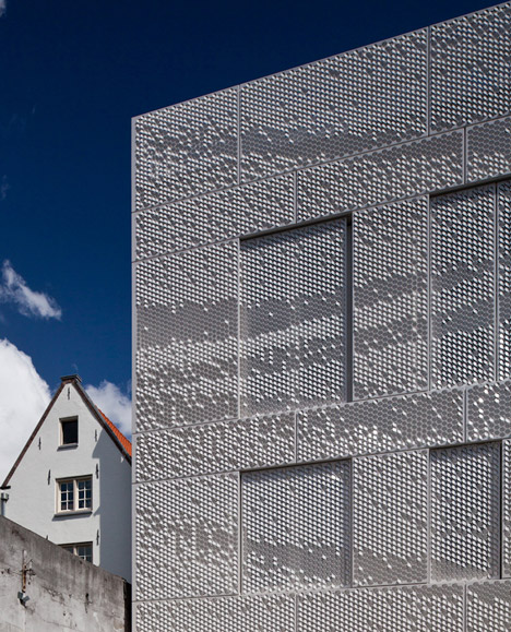
“With these industrially produced aluminium plates you can punch out a shape, then afterwards you can still bend the perforations, so then it can either catch light or cast a shadow,” he said. “If they are bent upwards they reflect the light and bending downwards they become darker pixels.”
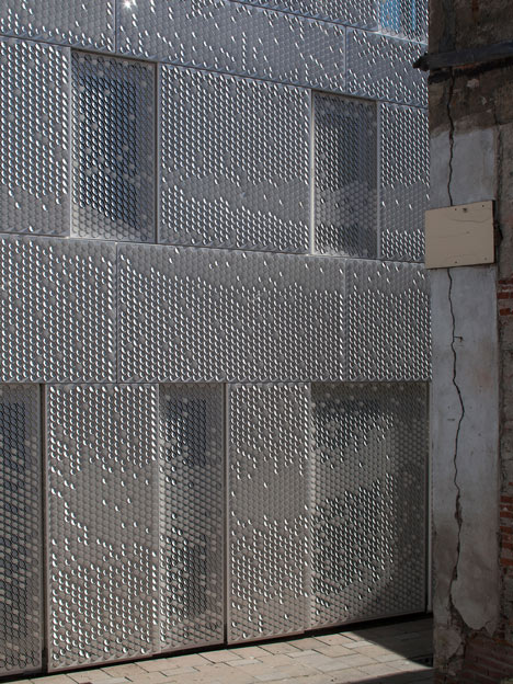
Above: photograph is by Luuk Kramer
Using this technique, the designer was able to replicate a pixellated image of a curtain by twisting over a million of the perforated hexagons using a custom-made tool.
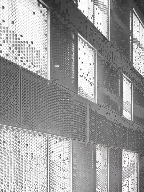
“On the back of the panel there was either a mark or not a mark,” revealed Kabel. ”If there was a mark you had to bend it upwards and if not then you bent it downwards, so actually everything was completely predetermined.”
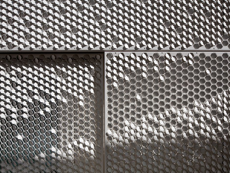
Above: photograph is by Luuk Kramer
Each aluminium sheet is also powder-coated to keep the facade white. ”It had to be white because in Amsterdam all of the houses from the canals were always painted white to get as much light as possible into the inner courts,” said Kabel.
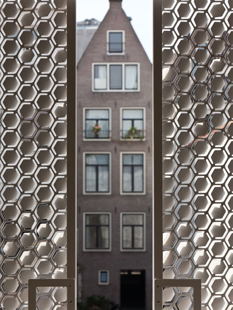
The textured panels cover the entire wall and even form shutters over the windows and doors.
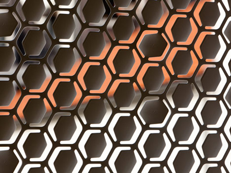
“We made a maquette a long time ago where we punched paper from two sides with needles. If you look now at the building it looks exactly the same as this punched paper. It really has an almost textile feeling to it,” he said.
Chris Kabel is a professor at the Design Academy Eindhoven and also at the Ecole Cantonale d’Art in Lausanne. See more projects by Kabel on Dezeen.
Other buildings we’ve featured with perforated metal facades include a set of decorative steel gates and a golden library.
[ طرح انتخاب شده از : Dezeen ]


