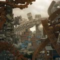
ببینین مثلا یه چیزی شبیه بامبو میاد به این راحتی و لاقیدی می ره تو معماری اون ها ولی این جا مثلا اگه بخوای حصیر رو ببری تو معماری، کلی متهم می شی به دهاتی بازی و .....
نمی خوام خدای نکرده اونا رو معیار کنم ها!!! ولی خب کار درست رو باید دید! هرچند در غرب باشه...
خوب درآورده.

© Fernado Gomulyo
Architects:
Rudi Kelana &
Gerard Tambunan
Location:
Jakarta, Indonesia
Structure Consultant: Ricky Theo
Main Contractor: PT. Wahana Cipta Selaras
Interior: Fenny Angka
Lighting: David Liming
Project area: 300 sqm
Project year: 2007 – 2008
Photographs:
Fernando Gomulya
© Fernado Gomulyo
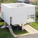
Realizing existing site with irregular land boundaries and the potential environmental and contoured land and trees are still green by the elements who happened to be used also as a nursery (nursery) and have a view of housing residents who are still natural, Architect of applying the concept of architectural space in which to integrate with outside spaces that include landscape and environment, both visually and acquired directly related to the outer spaces. Especially penempatanya maximally in spaces that are shared, such as living room, dining area and workspace. Where these spaces is a favourite space that will be widely used daily by the owner.

elevation 01
By leveraging the land contours, the contours of the lowest level there is a nursery building which was already an existing building land. And at the contour level above there are also car parking near the gazebo as an area which is also the recipient of the existing building. At first view toward the lowest contour is very tempting to use architects as building orientation on the contour of the land in the middle position, which consequently make the remaining land behind the building to not be maximal due to boundary conditions of the irregular land.

© Fernado Gomulyo
After the architect to go deeper and feel the situation on site with the imagination of the concept of orientation toward the lowest contour, then arose the idea to further unify every existing site conditions on each side. "Residual land" that are "offending" perverted thoughts as one of the potential that can be used as one of the orientation of view of space inside, in this case "remaining land" which is being used as garden steeper than coincidence workspace there are two trees Existing large, which is every big tree on this land be maintained as one element of landscape land. To be able to take advantage of "remaining land" which is steep, then the spatial scale of the working space created by vertical maximum, that is by elevating levels of ceiling and window space, so as to create the game a sense of space in this zone. Between the park and work spaces have water features and ponds so as to make space work memorable float on water. While buildings largely oriented towards the garden seedlings. The condition of the surrounding environment can also be enjoyed from the upstairs balcony deck-related from the family room.

© Fernado Gomulyo
At this time the work of communal space that is transparent from this house we put on the floor above to view a still beautiful environment can be fully utilized from this zone. Upper chamber is made as light and simple as possible in detail by using
steel and glass structure transparent. And also designed buildings standing rested on the bermaterialkan massive brick walls and plaster. Levels of this communal space in the level we equate with level entrance to the building is not prominent among sekitanya environment. While on the ground floor spaces are placed more private as the master bedroom, guest bedroom, den and communal terrace. Directing the movement of circulation starting from the entrance with a high level headed toward a low-level stepping stepping through a bag of water she floated towards the main door of the building, so as to create a game feeling different each corner.


