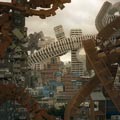
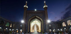
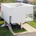
این سه تا مجموعه خیلی جالب طراحی شدند. به طوری در نسبت با یکدیگه طراحی شدند که در میون خودشون نوعی بافت شهری متفاوت از شهر و هویت دار درست کردند. تودههای سه تا بنا در میون خودشون راهها و کوچههایی درست کردند که خیلی متفاوت از بستر شهری، منجر به خلق محله هایی جدید شده...
می دونین این چنین کاری چه میزان رابطه مردم رو با این بناهای فرهنگی بالا می بره!؟ واقعا نمی ارزه صرف بخشی از زمین به درآمد این ایجاد رابطه؟

Location: Cao Chang Di, Beijing
Photographs: Li Shi Xing, Andrea Giannotti
Beijing urban expansion _
The fast and enormous urban development of Beijing has transformed the city into a metropolis made of suburban residential compounds, abandoned industrial plants, community housing blocks from the 70s-80s and popular self-grown villages. A mix of high rise residential areas, business districts, impressive infrastructures enclosing spontaneous house areas surviving the demolition and renovation dictated by the construction market. The population has grown from 1 to 18 millions in 60 years, and the size of the city has reached 5 times the ancient capital within the walls – the 2nd Ring Road.
The urban expansion, mostly based on imported urban models and low quality constructions, has been exploding in the past 30 years, and it is rooted with political and economical decisions, as well as local culture and history. Briefly, Beijing is a stunning showcase of urban consequences happening in the world’s first growing economy, during an explosive industrial revolution. Cao Chang Di _
In this complex frame, I would like to focus on an architectural and urban re-generation going in the opposite direction if compared to the majority of recent urban interventions. This is the completion of a series of art galleries at Cao Chang Di, whose projects have been completed in few years by Fake Design run by artist/architect Ai Weiwei.
Cao Chang Di is a peripheral village on the 5th Ring Road, where most of the buildings are spontaneous houses of families producing vegetables or working in the metropolis. It has that popular selfishness with basic economic exchanges character that we can usually find in the central hu-tong of Beijing. The only difference is that here we are many kilometres away from the centre, there are no historical buildings, and no tourist would ever think of visiting the area. Mr. Ai Weiwei decided to install here his Studio-House in 1999 in order to be based in a village on the way between the centre and the airport. Fake Design / Ai Weiwei at Cao Chang Di _
In short time, his intervention has been noticed, appreciated and requested by other artists, owners and even local authorities. The village had sufficiently free plots and existing structures to be renewed, and the local population seemed to welcome the galleries installed at Cao Chang Di. This because the artist’s philosophy is to use local materials, techniques and resources, cheap and available, and to build with the same knowledge of the local people, instead of declaring the buildings as something different, refined, unique, trendy or imported from other models. Mr. Ai Weiwei explains: personally, I take inspiration from local places and from local people, mostly poor people, or people who does not think about architecture. The aesthetic quality of the cheap, the necessary, whatever done with limited means are essential qualities of architecture.
Certainly the architecture of these projects does not show the “richness” of many institutional building developments through China: no shining glass, no technological facades, no imported stone nor wood, no monumental building sizes. It reflects Ai Weiwei’s conceptual sentence: make it simple.
And this sentence, even if said by a self-taught architect, recalls the concept of many modern masters of architecture, whose mission was the affirmation of a clean, neat and simple architecture against the re-proposition of old models.
Therefore, there is much more to be seen than simplicity. Grey Brick Galleries _
The village typical atmosphere – narrow and noisy streets between small houses and shops – shifts into a series of quiet courtyards, dominated by grey bricks volumes, blind walls, hidden gardens limited by wood fences. The Grey Brick Galleries may appear in high contrast with the rest of the village. Instead, considering the materials, the lines, the proportions, the simple details of the facades, we find that there is much more in common with the surroundings, and with the Chinese building tradition.
The si-he-yuan of the central hu-tong are courtyard houses with a blind external wall enclosing a central courtyard; the main local material is the grey brick; lights and shadows highlight the proportions between volumes; symmetry is also a constant character. Walking through the series of alleys in the Grey Brick Galleries we feel the same atmosphere of the narrow streets of the centre.
Inside, the buildings provide space for artists and exhibitions which move and change very often, therefore the flexibility of space is one of the most important aspect of the design. Skylights and double heights are often used for the exhibition spaces; the roughness of the brick-walls white painted and the industrial concrete floors make the interior elegant and simple as the exterior. The main character of the Grey Brick Galleries is the regular squared grid of the masterplan. This may also be seen as a reference to the Beijing squared urban configuration since its beginning. But it is only a recall, since the Red Brick Galleries develop the masterplan in another direction. Red Brick Galleries _
Heading West towards the 5th Ring Road, we find an ensemble of red volumes, the Red Brick Galleries. The plan of these galleries is animated by shifting the walls of the buildings in diagonal, opening to large common squares and closing into very narrow passages and hidden courtyards. The language is essential, red bricks framed by concrete structure; the floor is brick paved. The outside space, the relation between the volumes and their proportions are protagonist in this intervention: irregularity make it similar to the spontaneous developing of the village.
The poverty and simplicity of the materials seeks the sincerity of a building process completed with local resources. For instance, the absence of typical roofs is due to the unavailability of wood in Beijing’s territory: that’s why flat concrete roofs take place of the typical Chinese roofs.
What strikes you the most while wandering through these alleys, is the sense of discovery you feel each step you take. There is no need of elaborated materials or catchy detail solutions when the general plan is made of sudden openings, hidden courtyards and narrow passages: the visitor is on his own exploration. This way, we discover galleries and secret gardens, framed in a well composed organization of volumes and spaces.
On the West end of the Red Brick Galleries the volumes are smaller, more vertically than horizontally developed, and their interaction is much more articulated. This gives to the urban situation a third way of composition, made of really small vertical passages and courtyards within a very dense assembling of volumes. Before being a very good architectural project, the Grey and Red Brick Galleries are an excellent urban design. According to the artist/architect, their life time will be relatively short due to the land- use market and laws, but it has been a great occasion to complete these projects as a singular statement about urban developments in Beijing: local people and visitors enjoy the spaces and the galleries, they feel it part of the village identity, and there is a little part of economic feedback for the whole community.
It opens to a better quality and at the same time it fits the overall environment. Three Shadows Photographic Art Centre _
After crossing the main road at North side of Cao Chang Di we find a complex dedicated to photographic exhibitions, commissioned by photographer Rong Rong.
For this building, more public and with facilities as a cafeteria and a small library, Fake Design decides to adopt the same materials, concrete and grey bricks. The main volume encloses a triangular court, leaving one side open to the larger garden. The distinctive trait of the Photographic Centre is the treatment of the walls: by shifting the bricks in three layers of 6 centimeters, the light produces three shadows creating an interesting movement on the vertical surfaces. The same solution is applied on the external floor. The play of shadows on the bricks recalls the image of an ancient ruin, a sort of de-materialization of the hard surface. The overall effect is convincing, and again made with a very simple operation using the available materials.
The interior exhibitions space is a succession of rooms, on various levels, wide, artificially or naturally illuminated by skylights. Again, the roughness of the exterior is shown exactly the same way in the interior. A consistency often forgotten in contemporary design. Observing the current development of the building activity in overall China, too often left to the market rules and to the growing investments and consequent marking of richness and poverty gaps, to the total or partial disinterest for quality in urban developments, Cao Chang Di is an example which goes in the opposite direction.
Instead of applying and repeating ready-to-use models, it proposes to start from local culture and resources, in order to demonstrate what could be a good method of building the necessary city extensions.
Taking critically from foreign cultures and taking the best from Chinese culture.


