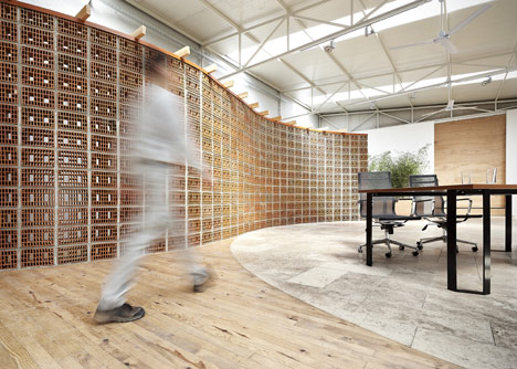
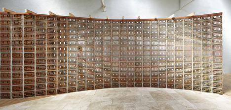
کاربرد متفاوت و خلاقانه این سفالهای مجوف توسط این استودیوی ترک، به تشکیل جداری فوق العاده زیبا و کاربردی در نقش جداکننده فضایی و به فضاسازی ای ویژه انجامیده.
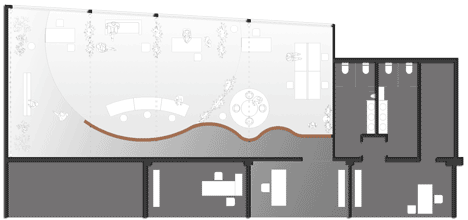
دقت داشته باشین که با انحنا دادن به پلان جدار، تونسته بدون سازه ای جدا، جداری به این ارتفاع و طول رو ایستا نگه داره؛ به موجب همین انحنای در پلان.
چنین ساختارشکنی هایی خوبه! ساختارشکنی هایی که به منظوری و هدفی عقلایی باشه نه به منظور ساختارشکنی!!!
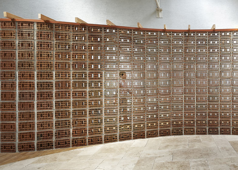
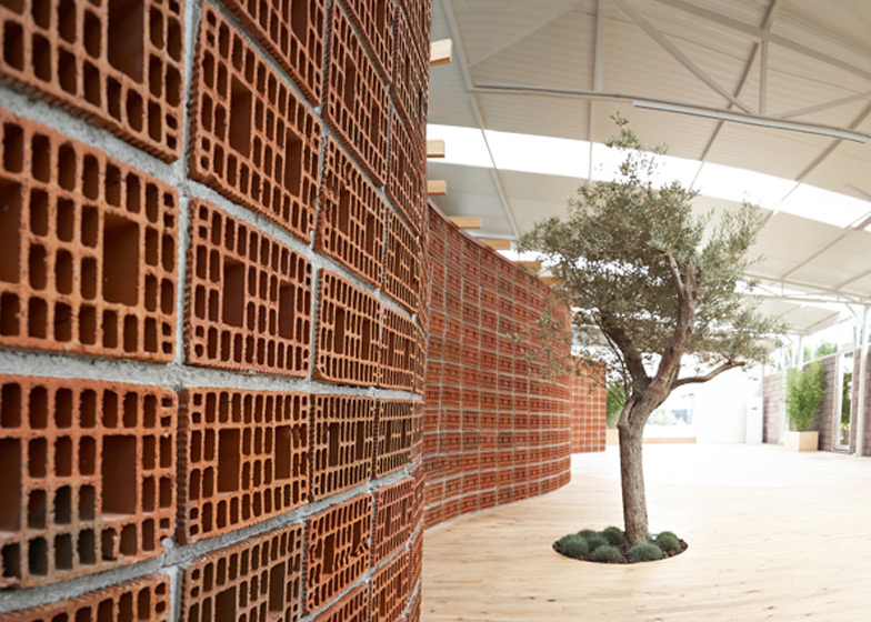
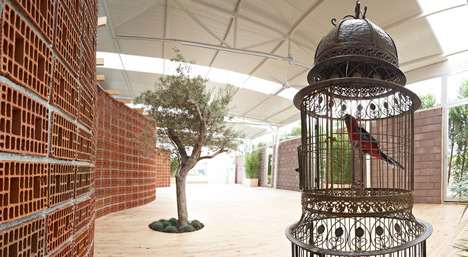
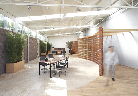
Turkish studio Yerce Architecture have transformed the headquarters of a furniture company in Izmir into an indoor garden with an olive tree, a pergola, a parrot and a wavy wall of perforated bricks.
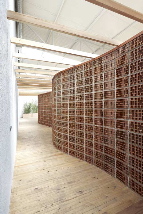
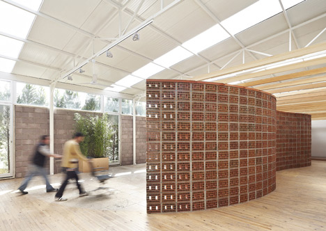 The wall separates the office from a new corridor, which leads beneath a row of timber beams towards meeting rooms and toilets.
In the office, chairs and desks are surrounded by plants on a floor of unpolished travertine, which architect Nail Egemen Yerce explains was ”inspired by the piazzas of Italy”.
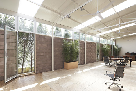
Four glass doors in the exposed blockwork side wall open up the room to a row of cypress trees just outside.
See more stories about office interiors on Dezeen »
Photography is by Emin Emrah Yerce.
Here’s some more information from Yerce Architecture:
OrfiSera
Looking at the design and realization process of the project one can notice that the challenge was to build up the perception of a firm through the ‘atmosphere’ it has and the ‘activities’ it hosts; instead of adopting a design approach which focused only on product display and aimed for a space with only showroom function.
Concept of ‘street’, ‘garden’ and ‘square’ were the key elements of the design. One was entering a luminous hall thanks to the light coming from its roof from a dimly lit existing showroom space. Naturally this was causing one’s eyes to be dazzled. We thought about connecting these two spaces with a buffer zone. In this way one could have entered to the luminous space with ‘slow’ but ‘balanced’ change of light after a curiousity awakening trip in a curvilinear path. This has become the expression of the ‘street’ idea. On one side our street we designed a brick wall in which the holes of the bricks were laid horizontally. This wall, as seen from the holes of the bricks forming it, gave mysterious information about the space lying behind it. Moreover the street was illuminated with the light passing through the holes of the bricks and thus its ground was showing the lacework created by light.
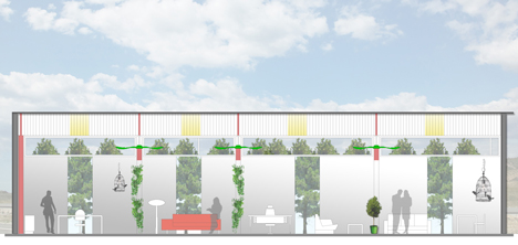
One full façade was facing amazing cypresses. We wanted to make this facade more transparent so that the exterior landscape could integrate with the inner space. Together with the transparency concept; a sculptural olive tree in the space, few bambu’s, ceiling ventilators circulating the air and a parrot reminding the tropical forests became the expression of the ‘garden’ idea.
Moreover we imagined a central space where various activities such as meetings, presentations, celebrations, plays, exhibitions, speeches can take place. We were inspired by the piazza’s of Italy made up of unpolished natural travertine. We chose the same material and used unpolished natural travertine in this central space which became the expression of ‘square’.
Last but not least, we realized that the abundant light which the space was receiving and the green plants it was containing made the space look like a greenhouse. This became the inspiration for the name of it, ORFISERA; ‘Orfis’, the name of the firm and ‘Sera’, greenhouse in Turkish.
Project name: OrfiSera
Client: Orfis Orçelik Office Furniture
Location: Izmir, TURKEY
Project year: 2011
Architect: YERce Architecture, Nail Egemen YERCE
Lighting design: YERce Architecture, Nail Egemen YERCE
Electrical engineer: Orfis Orçelik Office Furniture
Mechanical engineer: Orfis Orçelik Office Furniture
Construction: Nano Buildings, Hilmi Aydın NİĞDELİ
Landscape design: Nesil Landscape, Hakan ERDOĞAN


