حتما نام سیلیکون ولی رو شنیدین. منطقهای در ایالت کالیفرنیا که امروز میشه اون رو محلهی اکثر غولهای دنیای ارتباطات و رایانه و به خصوص اینترنت دونست. شرکتهایی نظیر گوگل، اپل، سامسونگ، انویدیا و حتی فیس بوک! تمام این شرکتهای بزرگ در این جا جمع شدند تا شاید پایتخت دنیای عصر ارتباطات رو با مختصاتی جدید شکل بدن
به تازگی و بعد از معرفی پروژه دفتر رسمی مرکزی اپل در سیلیکون ولی که توسط معمار انگلیسی تبار نورمن فوستر و تیمش طراحی شده یکی یکی شرکتهای بزرگ دیگه هم شروع به معرفی پروژه های دفاتر شون کردن. ابتدا فیس بوک. بعد گوگل و حالا انویدیا و سامسونگ.....
این مساله حتی منجر به تغییر شکلی اساسی در لنداسکیپ یا همون منظر سیلیکون ولی میشه چرا که ابعاد هر کدوم از این پروژه ها ابعادی شهری خواهد بود.
در این پست می تونین این تغییرشکل ناگهان رو در چند شات مختص به هر شرکت مشاهده کنین.
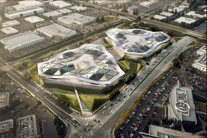
image © gensler / kilograph
gensler's recent release of two renderings for the NVIDIA headquarters is the latest in a series of large-scale campuses in the silicon valley area, a rapidly inclusive part of northern california famously home to a plethora of both powerful american technology companies and industry-changing start- ups. the overall environment is one teeming with possibility and the keen sense that the activities taking place in these buildings are changing global culture, human interaction and societal knowledge. while gensler's design sought to solve practical problems of program and circulation by consolidating staff spaces located across numerous small floors and discrete buildings, there was a more significant mandate to the brief-- that the architecture should posit a specific philosophy of progress inherent in the company's endeavors. the rhetoric of silicon valley architectural culture is quickly becoming centered on how the built environment
can optimize idea-making. large, open floor plans, seen in the proposals for gehry's facebook headquarters as well, are aimed at designing informal meeting spaces and maximizing opportunities for collaboration. whereas facebook's menlo park campus is a wall-less 430,000 square foot elevated room, the NVIDIA space takes it's cue from computer chip design, where information flow dictates form. two, 250,000 square foot floor plates are connected by oversized platforms and stair treads. vertical circulation becomes double bleacher seating, appropriate for casual and impromptu meetings. formally, the triangular shape of the exterior connects a network of thinkers on the interior by democratizing travel time between offices. although the nbbj-designed google bay view campus is still in it's conceptual phase, it too represents a significant shift in google's architectural culture; whereas in previous years the company has sought to take an existing office shell and input idiosyncratic interiors, the ground-up approach now allows the realization of a workspace desire for collaboration-- no 'googler' is more than a two and half minute walk from a coworker in the new design. the decision is a product of an active study by the company of their employees' habits. you can read more about google's interior office quirk here.

'NVIDIA headquarters' by gensler uses triangles as a powerful symbol of digital information
image © gensler
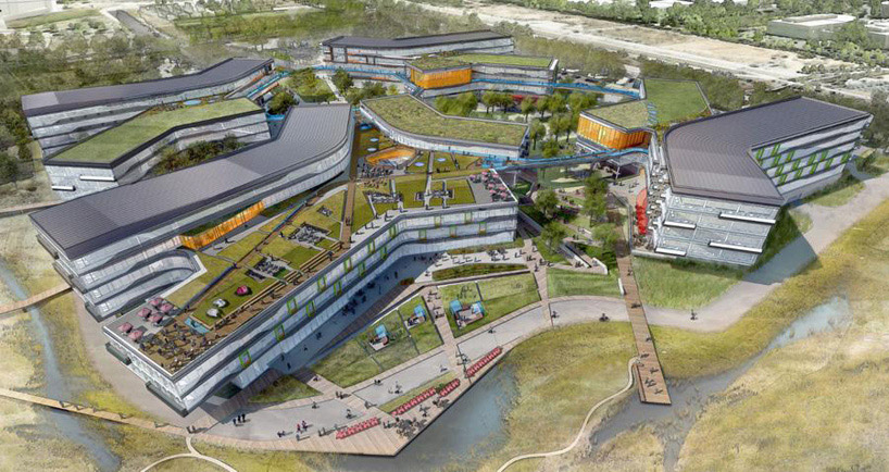
'google headquarters' by nbbj, bay view, california
image © nbbj
the sprawling landscape of southern california has also created a particular dialogue about the potential for roofscapes to impact interior spaces. NVIDIA's headquarters will keep with a ubiquitous triangle motif in a sculpted roof that allows generous amounts of diffused daylight and choreographs a rhythm of vaulted 'town-hall community' rooms and lowered, private work areas. last week, the menlo park planning commission just signed off on the facebook's headquarters which will now include a four foot thick layer of soil for a vast rooftop forest, complete with dozens of oak trees. the gehry team is even working with ornithologists to select building materials that will not reel in birds to an untimely death. the green roof is now a veritable park, a bolder change from the building's previous iteration, covered by designboom here. in a similar vein, global firm nbbj's design for samsung's silicon valley headquarters show two ten-storey layered edifices with overhanging structures covered in landscaping, consistent with their equally green bridged design for their recently unveiled google campus in bay view. a bent-rectangle plan of the googleplex sports significant bands of horizontal glazing and is tied together by nbbj's characteristic ribbons of circulation. the foster +partners-developed design for apple's headquarters, based around the self sustaining enlightenment symbol of a japanese 'enso', touts its eco-responsibility via on site electricity plant and ample central courtyard.
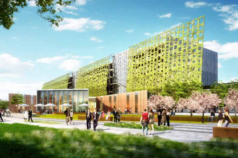
'samsung headquarters' by nbbj show early developments of green facades and landscaped levels
image © nbbj
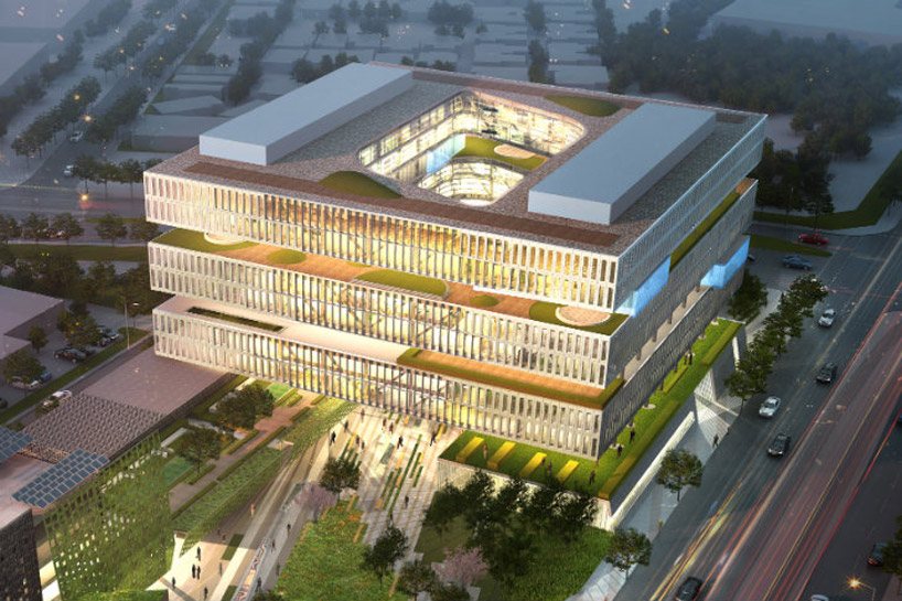
samsung's headquarters are layered green levels
image © nbbj
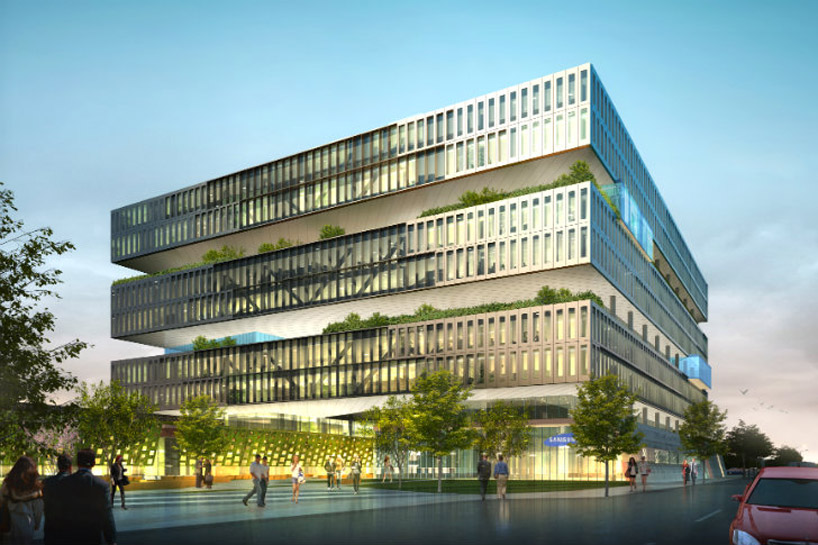
samsung's headquarters will be one of the taller buildings in the valley
image © nbbj
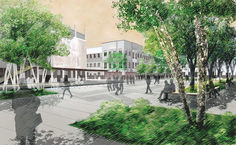
facebook's menlo park campus
image © facebook
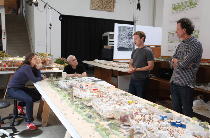
frank gehry, facebook ceo mark zuckerberg and gehry associates speak about the social network's sprawling menlo campus
image © facebook
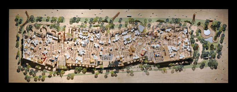
view of the open-plan facebook headquarters
image © facebook
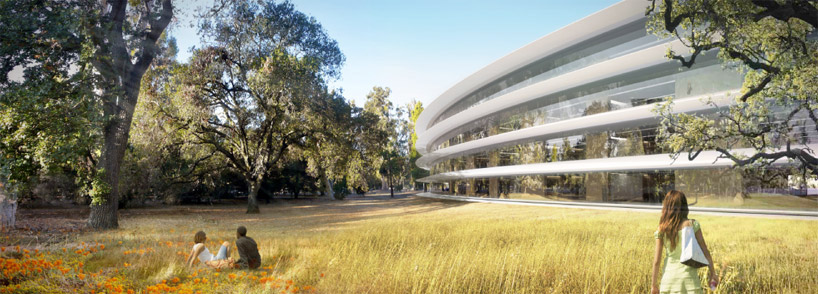
apple's ring-like home in cupertino california
image © foster + partners, apple inc.
the discourse surrounding the silicon valley building boom is one of tremendous response. these companies are a testament to important risk-taking bolstered by fervent belief in human progress. NVIDIA began as a three-person start-up and is now 8,000 strong. apple is the product of a tumultuous set of visionary ideas and incredible implementation. both facebook and google are growths of a college-aged endeavor. this an architecture of exciting possibility and competitive response for the greater good, where incidental spaces are seen as burgeoning opportunities for world-changing ideas and the built environment is a mirror of human thinking.
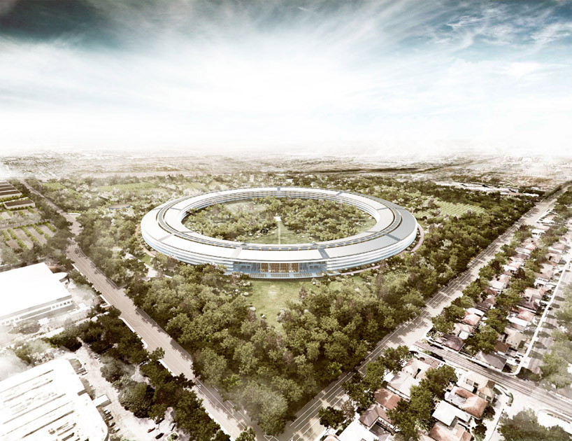
apple's valley addition is a distinct formal gesture on the landscape
image © foster + partners, apple inc.
[ طرح انتخاب شده از : Designboom ]


