Architects: XPIRAL
Location: Torreaguera, Murcia, Spain
Architect in Charge: Javier Peña Galiano
Promotor: DSL BUILDING S.L
Rigger: Jesus Tornero Molina
Contractor: S.L Imilce
Structural Consultant: IDEEE (Eduardo Díez)
Project Area: 346.66 sqm
Project Year: 2006-2008
Photographs: David Frutos
The two ‘atretic’ houses proposed, revolved around the idea of a redistribution of the plots along a row. The construction had to abide by the conditions of the maximum height permitted for buildings in the area and having to adapt to the topology of the existing plots.
cielo house ground floor plan
tierra house ground floor plan
The two houses are situated in heights that enjoy the total width of the new plot (12m), which is the benefit of having joined together the two original plots (6m each) in a row.
The new plot has an incline approximately 5m in height and adjoins public streets on three of its four sides, in this way a house can make the most of lower part of the site by creating a garden and adapting it to the topography (casa tierra), the other, in the higher part opens up to the countryside enjoying a panoramic view of the mountains and orchards (casa cielo).
© David Frutos
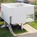
Casa tierra takes the form of a plinth constructed entirely from ceramic pieces combined with coloured elements. Casa cielo is structurally comprised of unfinished concrete, supported by the other module in its lower part and finished in reflective glass.
© David Frutos
The ceramic module aims to be something more than simply the facade of Casa tierra, it is constructed with the intention of forming the principle module of the project. It additionally lays out the diverse partitions of Casa tierra and Casa cielo and adds different degrees of transparency and light which is offered by the ceramic wine rack section made by the commercial brand ‘Cerámica Collado’.
© David Frutos
The holes in the wine rack section close with circular tiles made from multicoloured crockery, constituting an enclosure that satisfies the functional necessities of a standard facade. However, in the rest of the zones, the bottle rack section is not covered forming a lattice that allows for views depending on the position of the viewer. This permits the existence of material continuity in the entire elevation, which integrates the lattices for the terraces and patios and the shutters, whose boards are made with the same wine rack section, into the standard facade. Therefore, we can see that the ceramic facade is composed of two distinct elements; the fist is the bottle rack section, of which the principle module of the two houses is comprised. The second is the series of circular tiles of distinct colours made by a local craftsman. These fill the holes in the wine rack section where the facade has been constructed as an enclosed space. They are distributed according to a fading pattern that places the colour green in the lower zone, like a continuation of the garden, fading to blue in the upper creating a harmony between the colours of the sky and the gaps in the lattice. Crockery tiles are used in the facade to subtly spell the names of each of the houses, cielo and tierra.
© David Frutos
The design of both houses also adapted itself to the new volumetric distribution of the joint plots; Casa tierra offers a range of uses and court yards benefit of its excavated condition in the locale, Casa cielo is set up as a leisure space thanks to the panoramic views of the countryside surrounding it. Each house is accessed via an adjacent road, Casa tierra from AV/ Region de Murcia and Casa cielo from the pedestrian pathway at the rear of the plots.
Both houses make the most the setbacks brought about by regulations, in the form of how the buildings must be, for example the type of roofs that can be used, which allowed for the construction of green terraces which can be used by each of the houses.


