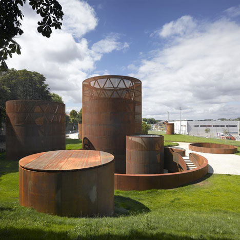
ترکیب صفحات فلزی پرداخت نشده با بسترهای طبیعی چه در مونومانهای مجسمهگون و چه در نماسازیها و بناهای معماری -البته اگر حسابشده و غیرمسرفانه باشه- معمولا ترکیب جاافتاده و متناسبیه. به خصوص که در پس ایام و گذر روزها، سطح فلز آرام آرام هرچه بیشتر با محیط همسان میشه و مثلا زنگ میزنه و لکههای تصادفی جالبی ایجاد می شه.
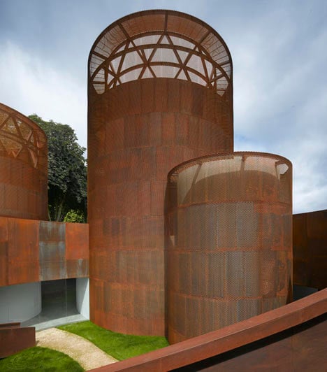
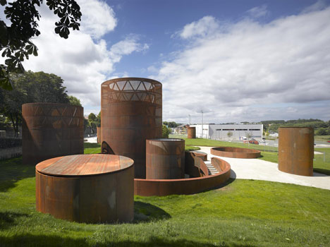
Nieto Sobejano Arquitectos have completed an underground museum in Spain with weathered steel towers and cylinders that emerge above a grass lawn (photographs by Roland Halbe and Fernando Alda).
Top and above: photography by Roland Halbe
The Interactive Museum of the History of Lugo exhibits objects, images and films that illustrate the historic Roman city and province.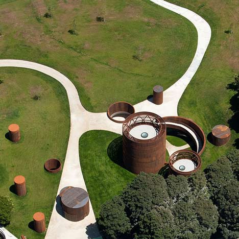
Above: photography by Fernando Alda
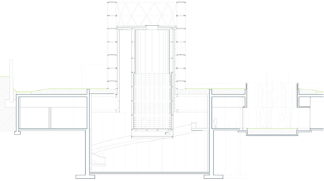
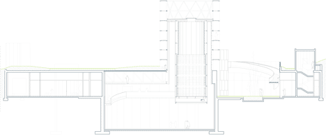
Visitors enter the building via a spiralling staircase that descends into a submerged circular courtyard.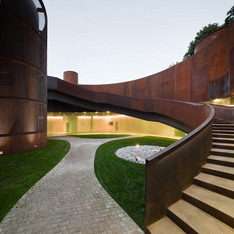
Above: photography by Fernando Alda
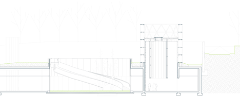
Three cylindrical towers provide enclosed rooms for audio-visual installations and are surrounded by the underground exhibition galleries.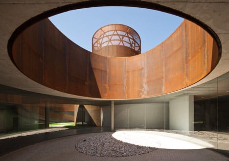
Above: photography by Fernando Alda
Parking for cars and buses is also provided underneath the landscape.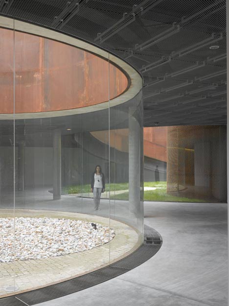
Above: photography by Roland Halbe
Weathered steel has featured in a few recent Dezeen stories – see our earlier stories about a canopy of flattened parasols and a museum pierced by bullet-sized holes.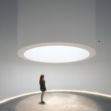
Above: photography by Roland Halbe
This is the third museum by Spanish architects Nieto Sobejano featured on Dezeen this summer, following one with a perforated aluminium skin andanother in a ruined castle – see all our stories about Nieto Sobejano Arquitectos here.
Above: photography by Roland Halbe
Fernando Alda shows more photographs of this project on his website.
Here is some more text from the architects:
Interactive Museum of the History of Lugo
1st Prize Competition 2007
The building site, which until not long ago housed industrial structures- is located in a position relatively displaced from the historic centre of Lugo. However, it will soon become a point of arrival for visitors to the city.
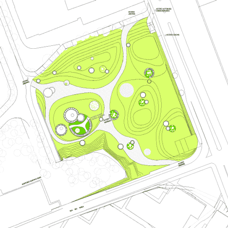
It may well seem awkward to assimilate architecture into landscape, but this is one of the cases in which we would like to think that the relationship between the two is more than a set phrase. We propose a museum-park or a park-museum, which will be linked to the sequence of green areas in the city, hiding the parking areas underground and emerging in a constellation of cylindrical lanterns scattered throughout a continuous green field.
Click above for larger image
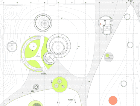
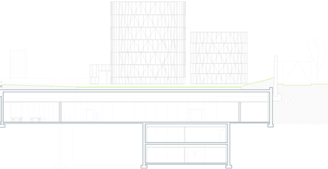
As it happens every time an architectural idea is intended to be built –which very frequently emerges from intuition-, it is the analysis of the program and its location that causes the specific proposal to make sense. We will divide the program into two large, connected areas: the parking and the visitor centre. The strong difference in height between the East and West ends of the building site suggests the possibility of taking +444m as an average reference level, in such a way that the garage is developed nearly at street level, thus remaining half-buried.
Click above for larger image
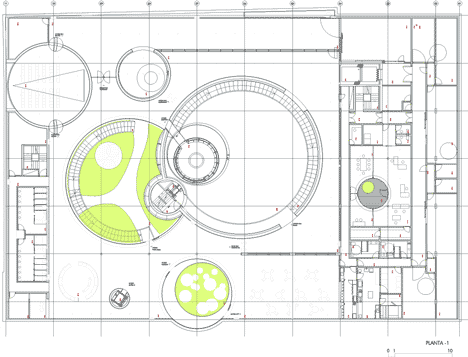
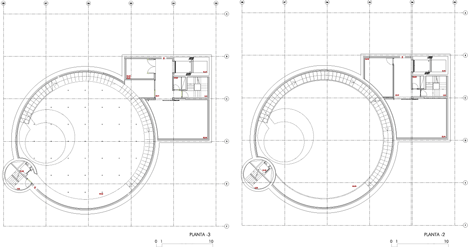
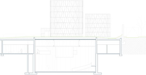
The Visitor Centre is essentially organised on a single floor illuminated through large circular courtyards, which allow natural light to penetrate and permit independent, controlled use. From the main courtyard, the most peculiar and tallest exhibition rooms will emerge -as contemporary cylindrical bastions-, which will become the image of the new building which is projected towards the exterior.
Click above for larger image
The exhibiting area has been conceived from two types of spaces: one which is neutral, flexible, suitable for the exhibition of panels, and will contain interactive modules or glass cabinets with original pieces; the other is defined by three cylindrical bastions, which are peculiar spaces due to their shape and dimension, suitable for audiovisual installations and projections. Both the Museum and the Visitor Centre are articulated in a sequence of interior and exterior spaces with multiple itineraries in which the landscape and History will be able to convey the intimate link that unites them.
Click above for larger image
Awareness towards environmental issues is a consequence of the project’s conception itself. The strong impact that a large amount of vehicles -cars and buses- would have produced on the surface is avoided by hiding the parking area under the undulating cover of vegetation. Likewise, the spaces destined for visitors and the museum occupy a half-buried floor under the same green foliage, which favours thermal inertia, thus reducing the need for energy contribution.
Click above for larger image
The exhibition towers emerging from the garden will be externally re-covered by a light, metallic skin, which will accommodate the incorporation of solar panels and night-time lighting in its design, by way of a contemporary interpretation of the Roman wall’s bastions.
Click above for larger image
The new Museum will entail the experience of a walk through a vegetative, metallic landscape, a luminous field whose night-time glow will seem to emerge from within the earth. The Lugo Museum will evoke images of fields and caves, walls and fortified towers –metaphors of a landscape and a culture that the inhabitants of Lugo carry within their own memory.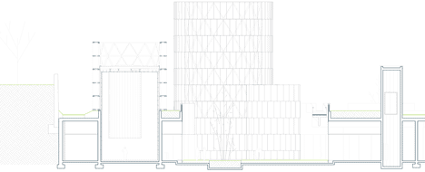
Click above for larger image
Location: Avda. Infanta Elena. Lugo. Spain
Client: Ayuntamiento de Lugo
Architects: Nieto Sobejano Arquitectos, S.L.P. - Fuensanta Nieto, Enrique Sobejano
Click above for larger image
Project Architect: Alexandra Sobral
Proyect Coordination: Vanesa Manrique
Collaborators: Borja Ruiz-Apilánez, Juan Carlos Redondo, Bart de Beer, Rocío Domínguez
Site Supervision: Nieto Sobejano Arquitectos, S.L.P. - Fuensanta Nieto, Enrique Sobejano
Miguel Mesas Izquierdo, Technical Architect
Structure: NB 35 S.L.
Mechanical Engineer: 3i Ingeniería Industrial, S.L.
Models: Juan de Dios Hernández – Jesús Rey, Nieto Sobejano Arquitectos, S.L.P.
Project: 2007
Construction: 2008-2011
Construction Company: U.T.E. Aldesa – Cuadernas
Click above for larger image
[ طرح انتخاب شده از : Dezeen ]


